
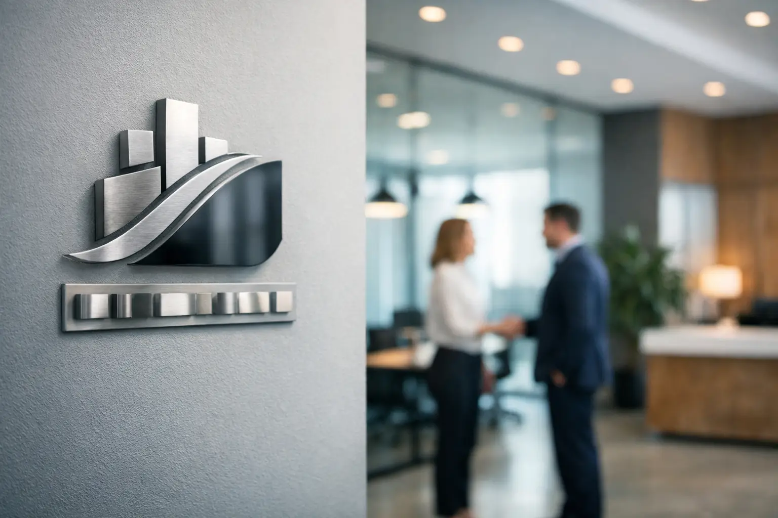
The first thing people notice when they walk into your office usually is not your pitch deck, your service menu, or your credentials. It is what the space says before anyone speaks. Custom business signage for offices shapes that first impression fast, and it can either reinforce your brand or quietly work against it.
For small to mid-sized businesses, office signage is not just decor. It is part branding, part wayfinding, part trust signal. The right signs make your business look established, organized, and easy to work with. The wrong signs – or no signs at all – can make even a strong company feel pieced together.
Why custom business signage for offices matters
When a lobby sign, suite sign, conference room graphic, and wall display all look like they came from different places, people notice. They may not say it out loud, but they feel the inconsistency. That matters because clients, partners, applicants, and even employees read your environment as proof of how you operate.
Good office signage adds credibility. It tells visitors they are in the right place and that your company pays attention to details. It also supports daily function. Clear directional signs reduce awkward moments. Branded room markers help guests move through the space without asking for help every five minutes. Interior graphics can also make offices feel more finished and less temporary.
There is a practical side here too. Businesses often spend money on websites, brochures, business cards, and trade show displays but leave the office environment disconnected from the rest of the brand. That gap creates friction. If your visual identity looks polished everywhere else, your physical location should match.
What office signage should actually do
A lot of businesses approach signage as a single purchase. They order a lobby logo and call it done. Sometimes that is enough, but often it leaves the office underbranded and harder to navigate than it should be.
The better approach is to think about signage as a system. Each sign should serve a job. One sign builds recognition at the entrance. Another helps people find reception. Another labels private offices, meeting rooms, or departments. Environmental graphics can reinforce brand personality and make blank walls useful instead of forgettable.
That does not mean every wall needs a quote decal or oversized logo. More signage is not always better. If the space gets cluttered, the result feels noisy and less professional. The goal is clarity, consistency, and purpose.
The signs most offices benefit from
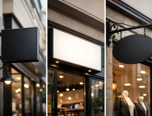
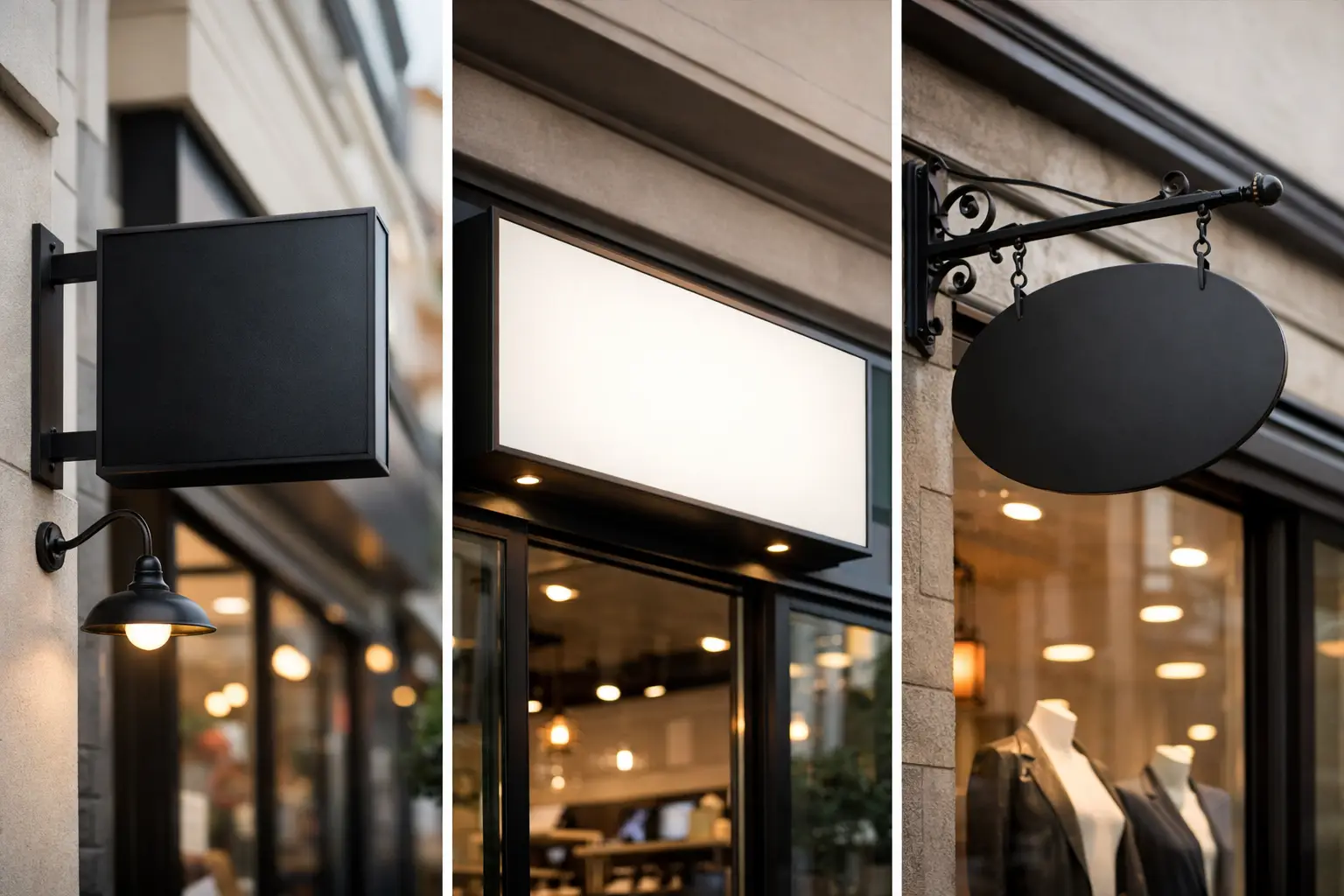
Most offices get the best results from a mix of branded and functional signage. Lobby signs are the obvious starting point because they anchor the first impression. Dimensional lettering, acrylic panels, metal finishes, and illuminated elements can all work well depending on the brand and the building.
Beyond the lobby, suite signs and door signs keep the space organized. Conference room markers, restroom signs, directional signs, and department identifiers help visitors move through the office without confusion. Window graphics can add privacy while still carrying brand elements. Wall murals and value statements can support culture if they are designed well and not treated like filler.
If your office hosts clients regularly, it may also make sense to include branded presentation areas, check-in signage, and temporary signs for events or promotions. For multi-tenant buildings, exterior and shared-space signage may need to follow property rules, which affects what is possible.
How to choose the right custom business signage for offices
The best signage decisions come from balancing brand goals, function, and budget. Start with the experience you want people to have. A law office, real estate firm, lender, medical practice, and creative company all need signage, but the tone should not be identical.
A more formal business may lean toward clean metal, frosted acrylic, subdued colors, and minimal messaging. A company with a more energetic brand may use bold wall graphics, stronger color contrast, and more expressive typography. Neither is automatically right. It depends on who you serve, what you sell, and how you want the space to feel.
Materials matter more than many buyers expect. Acrylic can look polished and modern without driving the cost too high. Brushed metal often adds a premium feel. Vinyl graphics are versatile and cost-effective, especially for walls and windows, but they are not the best fit for every use case. Wood can add warmth, though it may not align with every brand. Illuminated signs look strong in some lobbies, but in others they can feel too aggressive.
This is where custom design pays off. Signage should reflect the rest of your brand, not compete with it. Colors, fonts, spacing, logo usage, and messaging should align with your other materials. If your office signs look unrelated to your website, sales collateral, and print pieces, you lose the consistency that makes brands memorable.
Common signage mistakes that cost businesses more later
One of the biggest mistakes is treating signage as an afterthought. A business moves into a new office, orders furniture, sets up technology, and then rushes the signs at the end. That usually leads to compromises in design, materials, or placement.
Another common problem is piecing projects out to multiple vendors. One company handles the logo. Another prints the wall graphic. A local shop produces the door signs. The installer improvises placement. The result often looks close enough on paper but uneven in real life. Fonts shift. Colors vary. Finishes do not match. Details slip through the cracks.
Cheap signage can also get expensive fast. Lower-grade materials may peel, fade, warp, or look worn earlier than expected. That creates replacement costs and sends the wrong message in the meantime. Spending wisely does not always mean spending big, but it does mean choosing options that hold up and fit the space.
There is also the issue of overdesign. If every sign tries to be the star, the office loses focus. Strong signage should support the environment, not turn it into a showroom unless that is the intentional goal.
Why a coordinated brand approach makes office signage better
Office signage works best when it is connected to the rest of your brand system. That includes your logo standards, print materials, website visuals, trade show displays, and branded merchandise. Consistency does more than look good. It reduces errors, shortens decision-making, and helps customers remember you.
That is why many businesses are better served by working with one partner that understands both design and production. When the same team can align office signs with business cards, brochures, banners, digital assets, and promotional materials, the process gets simpler. You spend less time repeating yourself, chasing revisions, and fixing mismatched work.
For growing companies, that efficiency matters. A rebrand, office move, expansion, or renovation already comes with enough moving parts. Signage should reduce headaches, not add them. Echo Brand Geeks approaches projects with that reality in mind by helping businesses keep creative, print, and branded materials working together instead of pulling in different directions.
Planning your signage before you order
Before you approve designs, walk the space with real use in mind. Think about where guests enter, where they pause, what they need help finding, and which areas should reinforce the brand most clearly. Consider sightlines, lighting, wall surfaces, mounting restrictions, and building requirements.
It also helps to prioritize signs by business impact. If the budget is tight, start with the pieces that shape trust and usability the most. A polished lobby sign and clear directional signage often do more for daily experience than decorative extras. You can always build out additional graphics in phases.
Ask practical questions early. Will branding need to scale across multiple offices? Do signs need to be easy to update as teams change? Are you in a leased space where removability matters? These details affect the right material and installation choices.
Office signage is an investment in how your business feels
People do business with companies that look credible, organized, and intentional. Office signage helps create that impression quietly but powerfully. It gives your space structure. It makes your brand visible. It helps clients and staff feel like they are dealing with a business that has its act together.
The best custom business signage for offices does not just fill blank walls. It supports your brand, improves the experience inside your space, and makes your company easier to trust from the moment someone walks in the door.
If your office still feels generic, inconsistent, or harder to navigate than it should, that is usually a sign the branding is unfinished – not that your business needs to try harder to explain itself.


