
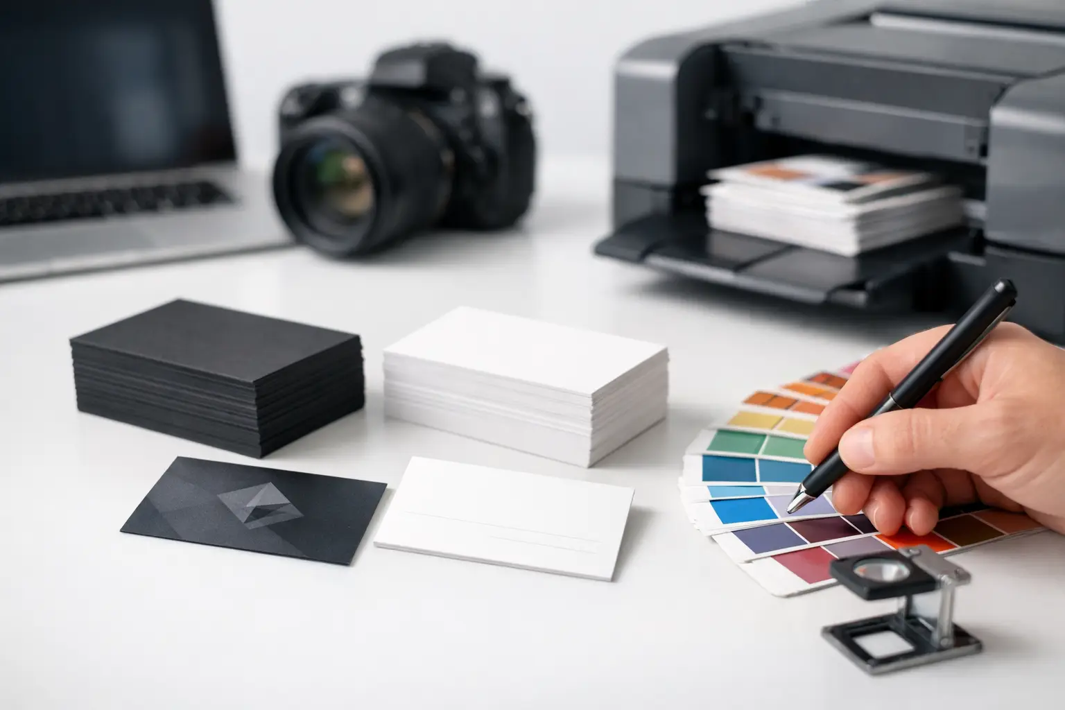
A bad business card usually fails in the same quiet way – it gets handed over, glanced at, and forgotten before the conversation is over. Good business card design and printing does the opposite. It gives people a reason to remember your name, trust your company, and take the next step.
For small and mid-sized businesses, that matters more than most people think. A business card is often the first physical piece of your brand someone sees. If it feels generic, outdated, or cheaply produced, that impression sticks. If it looks sharp, reads clearly, and matches the rest of your marketing, it adds credibility on the spot.
Why business card design and printing still matters
People sometimes treat business cards like a leftover marketing tool, but that usually comes from seeing too many weak ones. In real sales conversations, networking events, service calls, trade shows, real estate meetings, and local business interactions, a card still does a simple job very well – it makes your business easy to remember and easy to contact.
It also does something digital touchpoints cannot always do. It creates a physical cue. Someone can put it in a wallet, on a desk, in a folder, or next to a computer. That small piece of print keeps your name in the room after the conversation ends.
The catch is that not every card helps your brand. Some cards are too busy. Others are designed without thinking about how they will print. Some include too much information, and some leave out the details people actually need. The best results happen when design and production are planned together instead of treated as separate tasks.
What makes a business card actually effective
Strong business card design is not about cramming in creativity for its own sake. It is about making your company look professional and making your contact information easy to use.
Start with the basics. Your company name, logo, personal name, title, phone number, email, and website should be easy to find at a glance. If your audience benefits from a physical address, include it. If not, forcing it onto the card just adds clutter. The same goes for social handles. They help some businesses, but for others they distract from the main action you want people to take.
Readability matters more than many business owners expect. Fancy fonts, tiny text, weak contrast, and crowded spacing can make a card look less professional even if the design concept is good. A clean layout often performs better because people can understand it instantly.
Brand consistency matters too. Your business card should look like it belongs to the same company as your website, brochure, signage, trade show materials, social graphics, and printed collateral. When colors, fonts, logo usage, and messaging all line up, your business feels more established. When they do not, the card can feel disconnected, as if it came from a different company entirely.
Business card design and printing should be planned together
This is where many projects go off track. A design may look great on a screen, then lose impact once it is printed. Colors can shift. Thin lines can disappear. Margins can feel tighter than expected. Photos can print darker. Text placed too close to the edge can create production problems.
That is why business card design and printing should never be handled as two unrelated steps. The card needs to be designed for real-world production from the start. That includes bleed, safe areas, color mode, image resolution, paper choice, finish, and size.
A card for a law office, lender, contractor, realtor, or B2B service firm usually benefits from a polished, professional look with strong hierarchy and premium print quality. A card for a creative business may allow more visual personality. Neither approach is automatically better. It depends on your audience, your positioning, and how the card fits into the rest of your brand.
The design choices that affect results
The most effective cards are usually the ones with discipline. They know what to emphasize and what to leave out.
Logo placement sets the tone quickly. In some layouts, the logo should lead. In others, the individual contact name matters more, especially in relationship-driven industries. There is no fixed rule. The better choice depends on whether people buy from the company first or from the person first.
Color should support recognition, not overwhelm the layout. A bold brand color can make a card stand out, but only if contrast stays strong enough for easy reading. Dark backgrounds can look premium, but they need careful print planning because fingerprints, scuffing, and poor contrast can reduce the final effect.
White space is often undervalued. If every inch of the card is filled, nothing stands out. Giving elements room to breathe can make the card feel more expensive and more confident.
Then there is the question of one-sided versus two-sided cards. A one-sided card can work well when your information is simple and your branding is minimal. A two-sided card gives you more flexibility for branding, a service list, appointment reminder space, a tagline, or a QR code. The extra room can help, but only if it serves a purpose.
Printing choices that change the perception of your brand
People notice print quality even if they do not talk about it directly. A flimsy card can suggest a rushed operation. A well-produced card feels more established.
Paper stock is one of the biggest perception drivers. A thicker stock usually feels more substantial and credible in hand. Matte finishes often create a clean, modern look and are easy to read. Gloss can make colors pop, but it can also create glare and make writing on the card harder. Soft-touch and specialty finishes can elevate the experience, though they are not right for every budget or audience.
Size and shape also affect usability. Standard sizes are practical because they fit wallets and card holders. Custom shapes can stand out, but they can also feel gimmicky if they are not aligned with the brand. In many cases, it is smarter to invest in better design and better stock than in unusual dimensions.
Special finishes like spot UV, foil, painted edges, or embossing can create a premium impression. They can also add cost and complexity. If your margins are tight or your team goes through cards quickly, a simpler premium matte card may deliver a better return than an elaborate finish package.
Common mistakes that waste money
The most common problem is inconsistency. A business updates its website, logo, or messaging, but the business card still reflects an older version of the brand. That disconnect creates confusion.
Another issue is trying to make the card do too much. A business card is not a brochure. Listing every service, every phone number, every email, and every social platform usually weakens the piece instead of improving it.
Low-resolution logos and rushed file setup are also expensive mistakes. If artwork is not production-ready, print results suffer. Reprints cost money. Delays cost time. Brand damage costs more than either.
There is also a vendor management issue that many companies overlook. When design comes from one source, printing from another, and brand direction from a third, small errors multiply. Colors drift, specs get missed, and no one owns the full result. That is one reason businesses often prefer a partner that can manage design, production, and brand consistency under one roof.
When to refresh your business cards
If your logo has changed, your card should change. If your website, phone number, address, or title has changed, your card should change. Beyond that, refreshes are often worth considering when your current card no longer matches the quality of your business.
A company may have grown, raised prices, expanded services, improved its market position, or invested in a stronger brand identity. If the business card still looks like it came from an earlier stage, it can quietly hold the company back.
That is especially true for businesses where trust drives revenue. Financial professionals, real estate teams, contractors, consultants, healthcare-adjacent services, legal offices, and local service providers all benefit when their printed materials look current and credible.
A smarter way to approach the project
The best business card projects start with a simple question: what should someone feel about your business the moment this card hits their hand? Professional. Established. Approachable. Premium. Efficient. Local. Detail-oriented. That answer should guide both the design and the print choices.
From there, the process gets easier. Keep the message focused. Make the information easy to use. Match the card to your broader brand system. Choose print options that support the impression you want to create, not just the lowest possible cost.
For many businesses, the easiest path is working with a team that understands both creative decisions and print execution. That reduces back-and-forth, lowers the chance of errors, and helps the final piece feel intentional instead of patched together. That is the difference between just ordering cards and putting a real brand tool into the field.
A business card is small, but it does serious work. If yours is going to represent your company in one quick exchange, make sure it looks like your business is worth remembering.


