A customer may decide whether to walk through your door in the few seconds it takes to pass your location. That is why choosing the best signage types for storefronts is not simply a design decision. It is a visibility, credibility, and sales decision. The right sign tells people who you are, what you offer, and whether your business feels established before they ever speak to your team.
For small and mid-sized businesses, the strongest storefront signage balances three things: it must be easy to read, fit the building and local regulations, and look consistent with every other part of your brand. A beautiful sign that cannot be read from the street will not do its job. Neither will a cheap temporary sign that makes a professional business look unprepared.
Start With How Customers Find Your Location
Before selecting materials or lighting, consider how people approach your storefront. A retail shop on a walkable downtown street has different needs than a service business in a busy strip center or an office located on the second floor of a commercial building.
Distance matters. Drivers need larger lettering, stronger contrast, and a message they can absorb quickly. Pedestrians can read more detail, which creates room for window graphics, hours, service lists, and promotional messages. If your business relies on appointments, your sign may need to focus on location recognition and trust. If you depend on impulse visits, it needs to make your offer clear immediately.
Also look at the signs around you. When every neighboring business uses illuminated channel letters, a small printed banner may disappear. When a historic district has understated facades, an oversized LED display may feel out of place or violate local rules. The goal is to stand out for the right reasons, not create an expensive sign you cannot install.
Best Signage Types for Storefronts
There is no single best choice for every business. Most effective storefronts use a primary identification sign plus one or two supporting sign types that help people find, understand, and remember the business.
Channel letters for a polished, permanent presence
Channel letters are individually fabricated letters, logos, or shapes mounted to a building facade. They are a strong option for businesses that need a professional, established appearance, including medical offices, lenders, real estate firms, restaurants, salons, and retail locations.
They can be front-lit, back-lit with a halo effect, or non-illuminated. Illuminated channel letters cost more than basic flat signage, but they offer excellent nighttime visibility and long-term value. They also make your logo feel like part of the building rather than an afterthought.
The trade-off is installation complexity. Channel letters often require landlord approval, electrical access, permits, and a longer production timeline. If you lease your space, confirm the property’s sign criteria before finalizing the design.
Cabinet signs for high visibility and flexibility
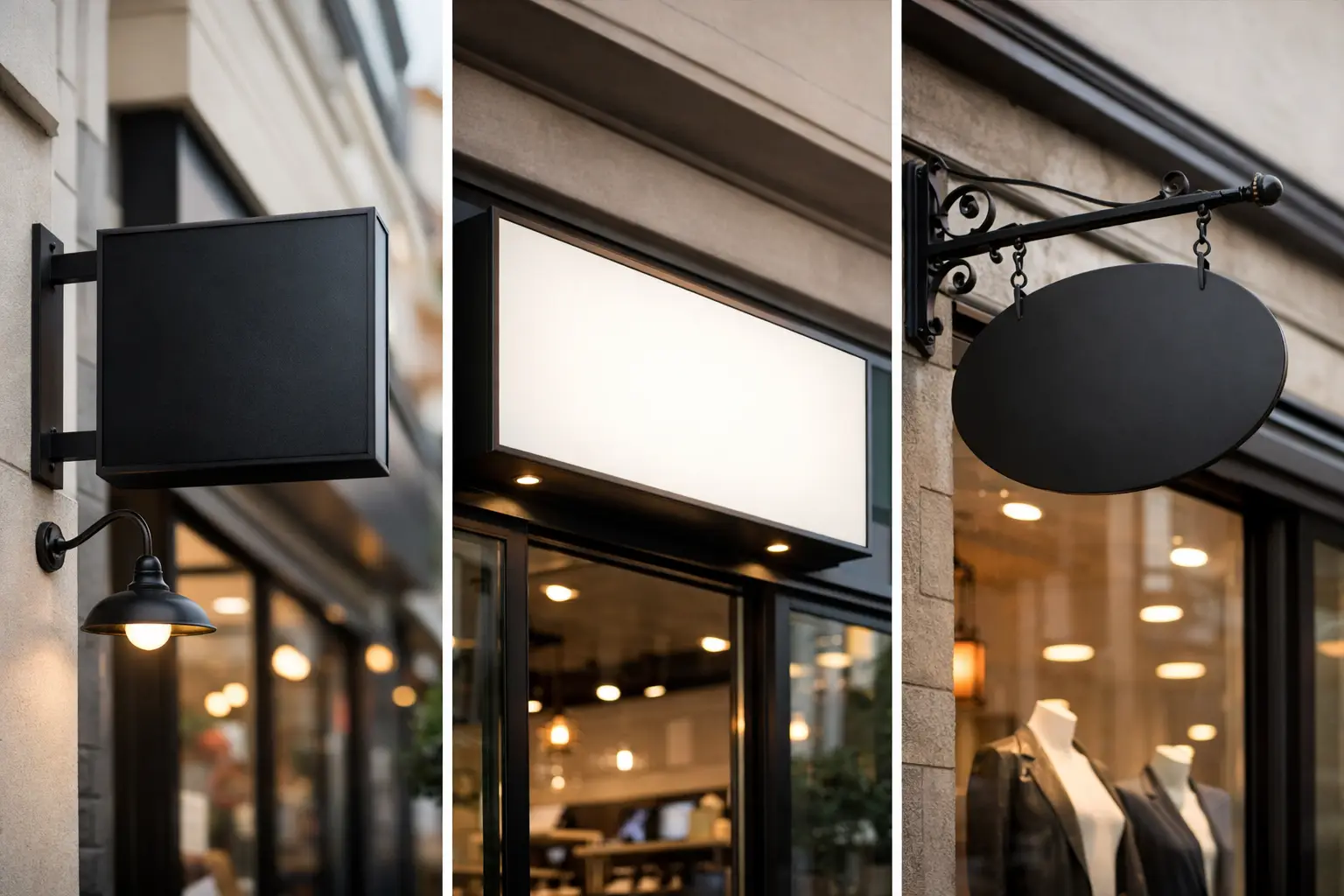
A cabinet sign uses a framed box with a printed or routed face, often illuminated from within. These signs are common in shopping centers, on building facades, and on pylon or monument structures near the road.
For businesses with a complex logo, a cabinet sign can display more visual detail than individual letters. It is also a practical choice when your storefront needs illumination but the property already has a designated sign box. Reusing an existing cabinet can sometimes lower installation costs, though the face, lighting, and condition of the structure should be inspected first.
Cabinet signs can look dated if the graphic is crowded or the colors are faded. Keep the design simple: a clear logo, high-contrast business name, and limited secondary information. A sign is not a brochure.
Dimensional letters for clean daytime impact
Dimensional letters are raised letters or logos made from materials such as acrylic, metal, PVC, or foam. They create depth and shadows that make a storefront look more intentional, especially in office parks, professional buildings, and interiors visible through glass entryways.
This option works well for companies that operate primarily during daylight hours or have exterior lighting already in place. Metal letters can communicate premium quality, while acrylic or PVC offers a more budget-conscious path without losing the polished effect.
Their limitation is nighttime visibility. Without dedicated lighting, dimensional letters may be hard to see after dark. They work best when your customers visit during business hours or when the building facade receives adequate exterior illumination.
Awning signs for shade and street-level character
An awning gives your business two benefits at once: it adds weather protection for customers and provides a prominent branding surface. The business name, logo, or a simple descriptor can be printed or applied to the awning valance and front face.
Awnings are especially useful for restaurants, boutiques, salons, cafes, and other pedestrian-oriented businesses. They soften a storefront and can make a location feel welcoming from the sidewalk. In downtown areas with strict visual standards, they may also be a more accepted option than large illuminated signs.
Fabric awnings need regular care, and color fading can become an issue in harsh sun. Choose durable materials, use brand colors that retain contrast over time, and avoid placing too much small text on the surface.
Window graphics for flexible, affordable messaging
Your windows are valuable marketing real estate. Vinyl window graphics can display your logo, hours, phone number, services, promotions, or privacy elements without the cost of a major exterior installation.
They are an excellent supporting sign, particularly for new businesses, seasonal offers, service providers, and storefronts with limited wall space. Perforated window film can allow people inside to see out while creating a bold visual statement from the exterior. Frosted vinyl is a smart choice for offices, salons, clinics, and other businesses that want privacy without blocking natural light.
The common mistake is covering every inch of glass with information. Leave breathing room. A customer should be able to identify your business and understand the main message at a glance.
Blade signs for businesses competing on foot traffic
A blade sign projects outward from the building so it can be seen by people walking parallel to the storefront. This makes it one of the most effective options for dense retail areas, downtown blocks, and mixed-use developments where a front-facing sign may only be visible when someone is directly in front of it.
Blade signs can be illuminated or non-illuminated and can range from clean and modern to decorative and traditional. They work particularly well when paired with a primary wall sign. One identifies the business from across the street, while the other catches customers moving down the sidewalk.
Because they extend over public or shared space, blade signs frequently require extra permits and landlord approval. Plan for those requirements early rather than treating them as a final detail.
Build a Sign System, Not a Collection of Random Pieces
The most effective storefronts do not rely on one sign to carry every message. They create a coordinated system. Your primary sign establishes your name. Window graphics clarify what you do. Door decals handle hours, contact information, and accessibility details. Directional signs help visitors find the entrance, suite, parking, or pickup area.
That consistency matters. If your website uses one logo, your business cards use another color palette, and your storefront uses different fonts, customers notice the disconnect. Even when they cannot explain why, inconsistent branding can make a business feel less reliable.
Use the same logo files, colors, type styles, and tone across your exterior sign, print materials, website, trade show display, and promotional products. This reduces production mistakes and gives every customer touchpoint more credibility.
Design Rules That Protect Your Investment
A sign does not need to say everything. It needs to say the most important thing clearly. For most storefronts, that means your business name or logo, followed by a short category descriptor only if the name does not explain what you offer.
Prioritize contrast over decoration. Dark letters on a light background or light letters on a dark background are easier to read from a distance than low-contrast color combinations. Avoid overly thin typefaces, script fonts, and long taglines on primary signage. These may look attractive in a design proof but become difficult to read from a moving vehicle.
Before approving production, review four practical factors:
- Viewing distance and traffic speed
- Daytime and nighttime visibility
- Local sign codes, landlord requirements, and permit needs
- Material durability for sun, rain, wind, and temperature changes
A lower initial price is not always the lower-cost choice. Faded graphics, peeling vinyl, failed lighting, or a sign that needs replacement after a short period can create more expense and more headaches than choosing the right materials from the start.
Make Your Storefront Work Harder
Your storefront sign should support the same promise customers see online and in your marketing. A polished brand system makes it easier for people to recognize your business, trust it, and take the next step. For a new location, a rebrand, or a sign refresh, Echo Brand Geeks can help bring design, print, production, and brand consistency into one coordinated process.
Choose signage that fits how customers actually see and use your space. When your sign is clear, durable, and unmistakably yours, it keeps working long after the doors open.