A great-looking logo on a screen can turn into a blurry business card, a dark postcard, or a sign with an unexpected white edge if the file is not built for production. When clients ask which files work for printing, the short answer is PDF. The better answer depends on what you are printing, how large it will be, and whether the artwork contains photos, logos, text, or all three.
Using the right file from the start reduces approval delays, production mistakes, and costly reprints. It also helps keep your brand consistent from a pocket-size business card to a trade show display.
Which Files Work for Printing Best?
For most commercial print projects, a high-resolution print-ready PDF is the most dependable choice. PDFs preserve layout, type, vector graphics, and image placement in one file. They are easy for a printer to review and less likely to shift when opened on another computer.
A properly prepared PDF is not simply any document saved as a PDF. It should have the correct finished size, bleed where needed, high-resolution images, and the appropriate color setup. A PDF exported from professional design software is generally more reliable than one converted from a low-resolution image, a presentation slide, or a web graphic.
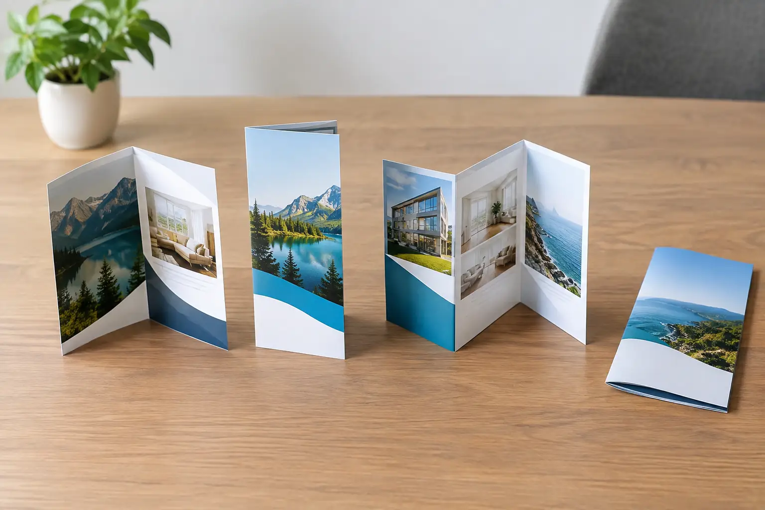
For example, the file requirements for business cards, postcards, brochures, flyers, menus, and direct mail pieces are usually straightforward: a press-ready PDF with 0.125-inch bleed on every edge that prints to the edge of the paper. Signs, banners, window graphics, and trade show displays can require different scale, resolution, and finishing considerations.
Why PDF Is the Standard
A print-ready PDF keeps the design intact. The printer sees the same page size, image placement, and typography that you approved. Fonts can be embedded, and vector artwork remains sharp at nearly any size.
PDF also gives production teams a practical way to check the job before it goes to press. If a file has missing bleed, thin borders, low-resolution photos, or an incorrect page count, those issues are easier to spot early.
That said, not every PDF is ready to print. A PDF made from a blurry social media image will still be blurry. The format helps preserve quality, but it cannot create detail that was never there.
Other File Types That Can Work
Some file types are useful depending on the artwork and the production process. Sending them can be appropriate when your print partner requests them, especially for custom projects or when revisions are still needed.
AI, EPS, and SVG for Logos and Vector Artwork
Adobe Illustrator files (AI), EPS files, and SVG files are vector formats. Instead of using a grid of pixels, they use mathematical paths. That makes them ideal for logos, line art, icons, lettering, and simple illustrations that may need to be printed at several sizes.
A vector logo can look crisp on a business card, vehicle decal, storefront sign, embroidered shirt design, or banner. This is why businesses should keep an organized set of original logo files, not just a JPEG copied from their website.
AI and EPS files are common for professional printing, signage, promotional products, and apparel decoration. SVG is excellent for digital use and can work in many production workflows, but not every printer accepts it directly. When in doubt, export a print-ready PDF and keep the original vector file available.
TIFF and High-Resolution JPEG for Photography
TIFF files are a strong option for high-quality photography because they preserve substantial image detail and support print-friendly color settings. They can be large, which makes them less convenient to email, but size is often a worthwhile trade-off for photo-heavy projects.
High-resolution JPEGs can also print well. They are widely accepted and easier to share, but JPEG compression can reduce image quality each time a file is saved. Use the original, highest-quality JPEG whenever possible. Avoid screenshots, images pulled from social media, and photos that have been repeatedly downloaded and re-saved.
PNG Files Have a Limited Print Role
PNG files are useful online because they support transparency and render clearly on websites. They are not usually the first choice for commercial printing. Many PNG files are created at screen resolution and in RGB color, which can lead to soft images or unexpected color changes in print.
A high-resolution PNG may be usable for a simple project, but it is better to provide the original vector logo, a high-resolution TIFF or JPEG, or a production-ready PDF. This gives your printer more control and gives you a better chance of getting the result you expect.
Resolution: The Detail Your File Actually Contains
For most printed marketing materials, images should be 300 pixels per inch (PPI) at their final printed size. A photo that looks sharp on a phone or laptop may only be 72 PPI or 96 PPI. That is enough for a screen, not a brochure or postcard.
Final size matters. A 300 PPI image at 4 inches wide can look excellent in a small flyer, but enlarging it to 10 feet wide for a banner will reduce its effective resolution. Large-format graphics can often be printed at lower resolution because viewers stand farther away, but the artwork still needs to be sized for the intended display distance.
Do not rely on enlarging a small image in a design program. Increasing the dimensions does not add real visual information. It simply spreads the existing pixels across a larger area, which can make the image look fuzzy or blocky.
Color Settings Can Change the Final Piece
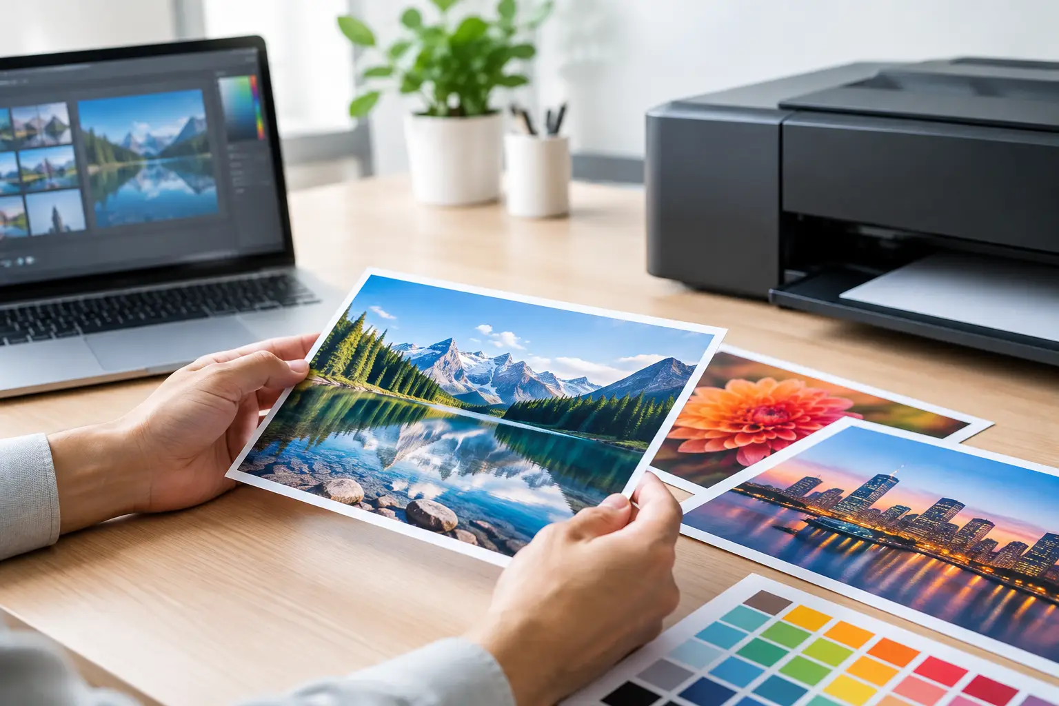
Screens use RGB color, made with light. Commercial printers typically use CMYK ink, made with cyan, magenta, yellow, and black. Because these systems create color differently, a bright screen color may print somewhat darker or less vivid than it appears on a monitor.
For standard print pieces, CMYK artwork is usually the safest setup. Brand colors that must match closely may require a Pantone spot color or a specific production method. This matters for established logos, franchise materials, event branding, and any piece where a consistent color is part of your professional identity.
There is a trade-off here. Converting everything to CMYK too early can limit flexibility if you also need the design for web use. A smart workflow maintains original brand assets and then creates print-specific files for production. That keeps your website, signage, apparel, and print materials working from the same brand foundation without forcing one file to do every job.
Bleed, Safe Areas, and Trim Lines Matter
If a background color, photo, or graphic touches the edge of a printed piece, it needs bleed. Bleed is extra artwork that extends beyond the finished trim size, usually 0.125 inch on each side for standard print jobs. After printing, the piece is trimmed to its final size.
Without bleed, even a small shift during trimming can leave a thin white edge. It is one of the most common reasons otherwise polished artwork needs to be corrected before production.
Keep important text, logos, phone numbers, and QR codes inside a safe area. Do not place critical information too close to the edge, fold, perforation, grommet, or pocket area of the finished product. A postcard and a tri-fold brochure may use the same logo and message, but their layout rules are not identical.
Files to Avoid Sending as Final Artwork
Microsoft Word, PowerPoint, Canva sharing links, screenshots, and images copied from a website are useful during planning, but they are not always production-ready final files. They can have missing fonts, shifted elements, low-resolution photos, or incorrect page sizes.
Canva can produce usable print PDFs when the document is set up correctly, but its templates are not a substitute for checking specifications. Confirm the finished size, bleed, image quality, and export settings before approving production. The same principle applies to any online design tool.
If your printer asks for original files, send the packaged design files along with linked images and fonts when possible. This is especially helpful when a project needs updates, resizing, or a custom production adjustment. For most routine print orders, however, a final approved PDF is the cleanest handoff.
A Simple Pre-Print Check
Before submitting artwork, verify the finished dimensions, bleed, and page count. Confirm that photos are sharp at final size, colors are set for the intended process, and all spelling, contact details, offers, and QR codes have been reviewed. Then inspect the PDF at 100% zoom, not just as a small screen preview.
For a campaign with several pieces, check consistency as well. Your business cards, brochures, signage, direct mail, and promotional items should use the same logo version, core colors, and contact information. Small differences across vendors and files can make a business look less established than it is.
The best print file is the one built for the job before production begins. When you are unsure, provide the original assets and ask for a preflight review. A few minutes of file checking can protect your budget, your timeline, and the professional impression your brand needs to make.