
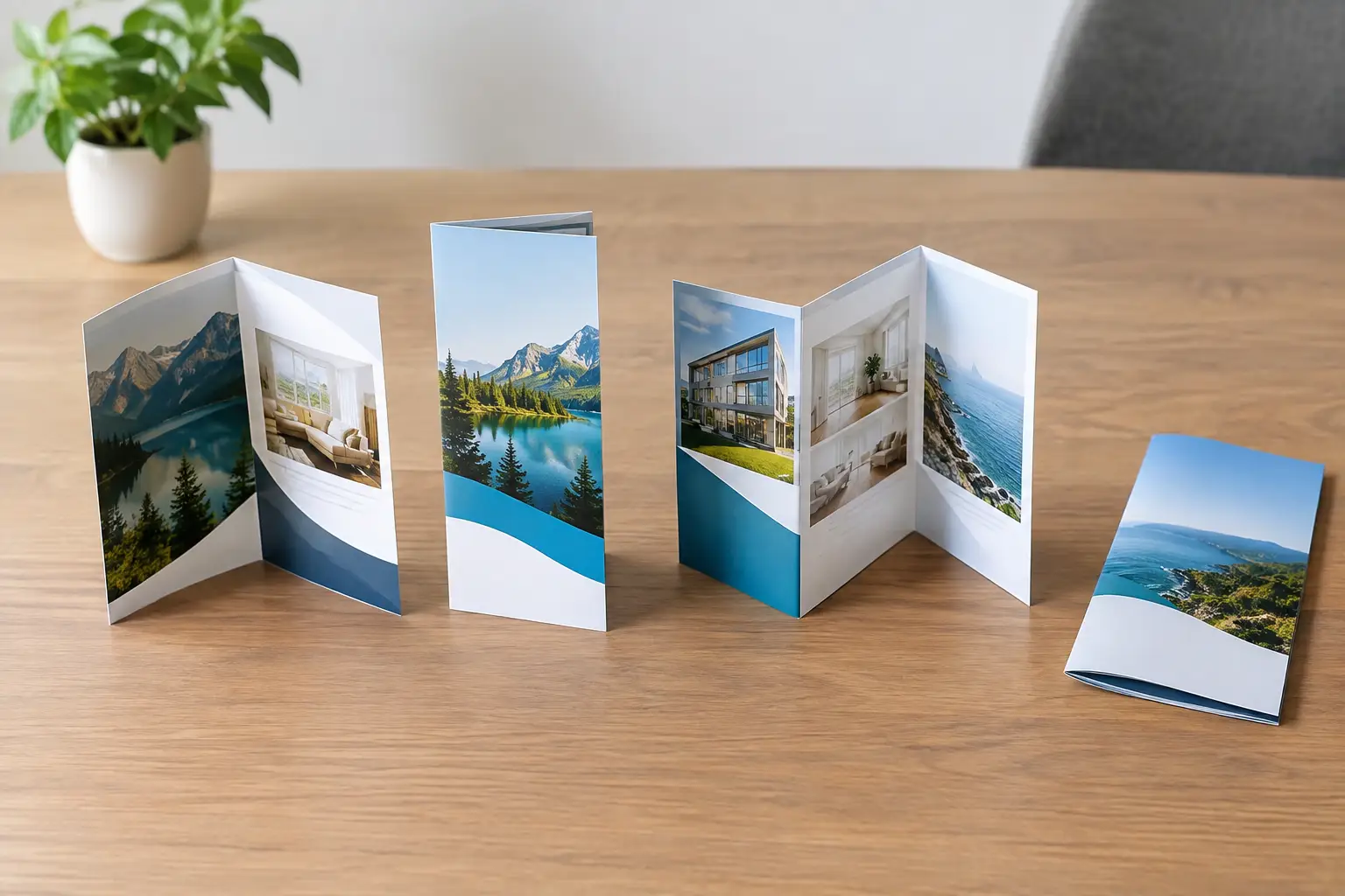
A brochure is more than a sheet of paper with panels. The way it opens determines what customers see first, what they read next, and whether your message feels organized or crowded. This brochure folds comparison will help you choose a format that supports your sales goal instead of creating avoidable design and print headaches.
For a contractor, lender, real estate team, medical practice, or B2B company, the best fold is rarely the most elaborate one. It is the one that gives your offer room to make sense. Start with the customer action you want: call, book, visit, request a quote, or compare services. Then choose the fold that presents that decision clearly.
Brochure Folds Comparison: Start With the Message
A fold controls the order of information. It creates a physical path through your content, which means it should match how much explanation your buyer needs before taking action.
If you have one primary service, a strong headline, and a clear offer, a simple bi-fold may be all you need. If you need to introduce several services, explain a process, show a menu, or walk prospects through a property or program, multiple panels can do more of the selling.
More panels are not automatically better. Every extra fold adds design constraints, more potential for cramped copy, and sometimes higher production costs. A brochure should make your business easier to understand, not give customers another reason to set it down.
Bi-Fold Brochures: Clean and Professional
A bi-fold brochure is folded once down the center, creating four panels: a front cover, two inside panels, and a back panel. It works especially well for professional services, company introductions, event programs, product sheets, and premium presentations.
The advantage is breathing room. Each inside panel can carry a substantial image, a short service description, or a simple comparison without feeling busy. Because the front cover has a natural booklet feel, a bi-fold is also a good choice when your brand needs to communicate credibility and polish.
The trade-off is limited sequencing. You have fewer places to break up a longer story, so it is not ideal for businesses trying to explain six services, a detailed process, and multiple offers at once. If the content is dense, a bi-fold can quickly become a mini catalog without enough space to support it.
Tri-Fold Brochures: Familiar and Versatile
The tri-fold is one of the most common brochure formats for good reason. It divides a sheet into six panels, with one outside panel folding inward. Customers recognize how to open it, and businesses can use the panels to present information in a logical progression.
This format is a practical fit for restaurants, home service companies, healthcare offices, financial professionals, tourism businesses, and local organizations. The cover can lead with a benefit, the inside spread can explain services or features, and the back panel can hold contact details, hours, a map, or a call to action.
A tri-fold needs careful production planning. The panel that folds inside is typically slightly narrower than the other two panels. If every panel is designed at exactly the same width, the fold can buckle or look uneven. This is a small technical detail that prevents a very visible mistake.
Tri-folds also reward concise copy. Treat each panel as one clear idea. For example, a roofing company might use panels for storm damage, roof replacement, repair services, financing, before-and-after proof, and contact information. Trying to force an entire website onto six narrow panels usually weakens the piece.
Z-Fold Brochures: Better for Step-by-Step Stories
A Z-fold uses three panels that fold back and forth in a zigzag pattern. When opened, it lays relatively flat and reads like a continuous horizontal sequence. That makes it useful for timelines, processes, service workflows, product comparisons, and visual stories.
A mortgage professional can use a Z-fold to show the path from pre-approval to closing. A manufacturer can use it to explain specifications, capabilities, and quality control. A developer can use the extended layout to show a site plan or phased project story.
Unlike a tri-fold, Z-fold panels are usually equal in width. That can simplify some layouts, but it does not eliminate the need for proper fold allowances, bleed, and safe margins. The main limitation is the cover experience. A Z-fold does not have the same traditional booklet opening as a tri-fold, so it may feel less formal for a corporate overview or high-end presentation.
Gate Folds: Strong for Reveals and Premium Offers
A gate fold has two side panels that open inward to meet in the middle. The center spread is revealed when the brochure opens. This format creates a sense of anticipation, making it a strong option for a major product launch, luxury property, annual report, high-value invitation, or brand story built around a large image.
The center reveal is the reason to choose a gate fold. A wide architectural rendering, a dramatic project photograph, or a bold before-and-after visual can make a stronger impression than the same image broken across narrow panels.
Gate folds are not the efficient choice for every campaign. They typically require more careful setup, are less convenient for dense informational content, and can cost more than common folds. Use one when the opening moment matters enough to justify the added complexity. If your priority is distributing a clear service menu at a community event, a tri-fold will often do the job more efficiently.
Accordion and Roll Folds: When You Need More Panels
Accordion folds create a series of equal panels that open one after another. They are useful for maps, schedules, event guides, detailed product lines, instructional pieces, and presentations where each section needs a distinct visual block. Because the brochure can expand into a long strip, it gives you more room to organize a sequence without turning every panel into a wall of text.
Roll folds also use multiple panels, but each panel rolls inward over the next. They can create a controlled, progressive reveal that works well for educational content, plans, packages, and multi-step offers. However, inner panels must be progressively narrower so the piece closes correctly.
These formats can solve a real content problem, but they demand strong organization. More panels mean more chances for customers to lose the thread. Keep the visual system consistent with repeated type styles, clear headings, and a logical reading order. If the brochure needs an instruction manual to explain how to read it, the fold is working against you.
Choose a Fold Based on How It Will Be Used
The distribution method matters as much as the content. A handout at a trade show needs a cover that catches attention quickly and panels that can be scanned while someone is standing at your booth. A direct-mail piece needs to meet mailing dimensions, leave space for addressing if required, and survive handling without opening or scuffing. A leave-behind for a sales appointment can support more detail because the conversation provides context.
Paper stock changes the decision, too. A heavier stock can make a premium bi-fold or gate fold feel substantial, but heavy paper may crack along folds if it is not scored properly. A lighter stock folds easily and keeps mailing costs down, though it may not communicate the same value for a high-end brand. Coating, paper thickness, fold direction, and ink coverage all affect the finished result.
This is why design and print should be planned together. Choosing a fold after a layout is complete often leads to squeezed panels, bad breaks in images, and copy that lands in the fold. Starting with the final format helps protect both your brand and your print budget.
Build Each Panel Around One Job
The cover should earn the open. Use a clear benefit, a relevant image, and enough brand recognition that people know who is speaking. Inside panels should answer the questions a prospect will naturally ask: What do you offer? Who is it for? Why should they trust you? What happens next?
Save the back panel for practical information. Contact details, a concise call to action, office hours, service areas, licensing information, a QR code, or social handles can live there without interrupting the sales message. If the brochure is part of a larger marketing system, make sure its colors, voice, photography, and offer match your website, signage, business cards, and promotional materials.
The right brochure fold does not need to be flashy. It needs to make your brand easier to follow, easier to remember, and easier to choose. When the format, message, and production details are planned together, the finished piece does more than look professional – it gives customers a clear reason to take the next step.