

A lot of service businesses waste money on flyers for one simple reason – they design for appearance first and response second. A nice-looking piece is not the same as a useful one. If your flyer design for service businesses does not quickly show what you do, who you help, and what the next step is, it becomes expensive paper.
That is the real job of a flyer. It should help someone make a decision fast. Whether you run a plumbing company, cleaning service, home remodeling business, HVAC company, landscaping crew, pest control brand, or local B2B service, your flyer has to earn attention in seconds and create enough trust to get a call, a quote request, or a visit to your website.
Why flyer design for service businesses is different
Service businesses are selling trust before anything else. In many cases, the customer is not buying a product they can hold. They are buying reliability, speed, professionalism, and confidence that the job will be done right. That changes how a flyer should be built.
A retail flyer can focus on product photos and prices. A restaurant flyer can lean on appetite and convenience. A service flyer needs to answer a different set of questions. Can you solve my problem? Do you work in my area? Are you credible? How do I contact you right now?
That is why vague messaging hurts service brands more than most. A flyer that says quality service at affordable prices tells the reader almost nothing. A flyer that says same-day drain cleaning in Dallas with licensed technicians and upfront pricing gives them a reason to keep reading.
What an effective flyer needs to do
The best flyers do not try to say everything. They organize the most important information in the order a prospect needs it. First comes the problem or offer. Then the proof. Then the action.
If someone looks at your flyer for three seconds, they should still understand the basics. Your company name alone is not enough. The strongest flyers lead with a clear service statement or promise. That might be emergency roof repair, weekly office cleaning, custom signage for retail stores, or local bookkeeping for small businesses. Clarity always beats cleverness.
The next layer is support. This is where you add the details that reduce hesitation. Years in business, certifications, service area, response time, financing options, or a short list of core services all help. Testimonials can work too, but only if they are short and believable. A long paragraph from a customer usually gets ignored on a flyer.
Then comes the call to action. This part gets mishandled all the time. If your flyer ends with contact info and no direction, you are making the customer do extra work. Tell them what to do next. Call today for a free estimate. Scan to book service. Schedule your consultation this week. Small shift, big difference.
Design choices that help or hurt response
A good flyer is not crowded, and it is not empty just for the sake of looking modern. The right balance depends on the service, the audience, and how the flyer will be used. A handout at a trade show has a different job than a direct-mail flyer or a leave-behind after a sales visit.
Still, a few design principles stay consistent. Hierarchy matters. The most important message should be the easiest thing to see. That usually means a strong headline, a supporting visual, and one clear call to action. If every element is competing for attention, nothing wins.
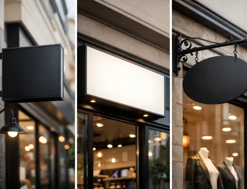
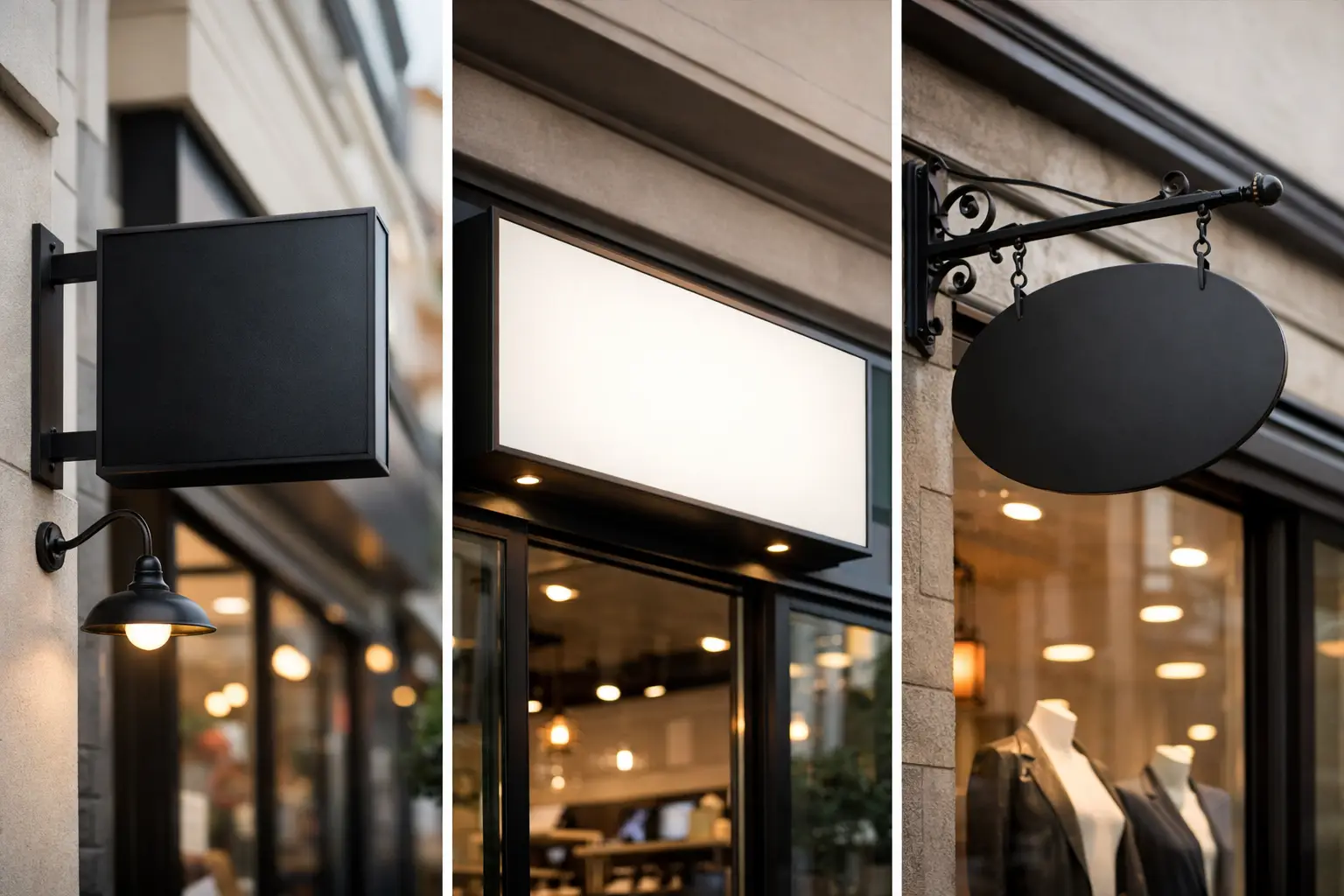
Images matter too, but only when they are relevant. Generic stock photos can make a flyer feel interchangeable. Real project photos, team photos, or branded imagery often perform better because they feel specific and credible. For service businesses, showing actual work can be more persuasive than trying to look polished in a generic way.
Color should support recognition, not create confusion. If your website, business cards, vehicle graphics, and flyers all look unrelated, you lose one of the biggest advantages in local marketing – familiarity. Consistent branding makes you easier to remember and easier to trust. That is one reason businesses often get better results when print and brand execution are managed together instead of split across multiple vendors.
Typography deserves more attention than it usually gets. Decorative fonts, tiny text, and low-contrast layouts hurt readability fast. Most flyers are viewed quickly, often in poor lighting, from arm’s length, or while someone is distracted. If people have to work to read it, they usually will not.
Common flyer mistakes service businesses make
The biggest mistake is trying to fit an entire brochure onto a single sheet. When a flyer is overloaded with service lists, badges, paragraphs, coupons, disclaimers, and multiple offers, the message gets diluted. More information does not always mean more persuasion.
Another common issue is leading with the company instead of the customer problem. Your logo matters, but it is rarely the main reason someone stops to read. Start with what they need. Water damage restoration in 60 minutes is stronger than placing a large logo at the top and hoping brand recognition does the rest.
Poor print decisions can also drag down performance. Thin paper, muddy colors, blurry images, and weak finishing make a business look less established than it is. That does not mean every flyer needs premium paper stock. It means the final piece should match the level of professionalism you want associated with your brand.
There is also the issue of disconnect. A flyer promises one experience, the website looks different, the business card says something else, and the sales rep uses another version of the message. That inconsistency creates friction. People notice when a business does not look coordinated, even if they cannot explain why.
How to tailor flyer design for service businesses by use case
Not every flyer should follow the same formula. A door hanger style flyer for residential neighborhoods should be faster and more direct than a flyer handed out after a networking event. A B2B service piece may need more credibility markers and less emphasis on discounts.
For local consumer services, urgency and convenience often matter most. Fast response times, local coverage, limited-time offers, and visible phone numbers tend to carry weight. For higher-ticket services like remodeling, legal support, or financial services, the flyer usually needs to build confidence first. Strong branding, testimonials, certifications, and a cleaner layout often work better than aggressive promotional language.
If the flyer is part of a larger campaign, it should not act alone. It should match the landing page, postcard, trade show display, email follow-up, or leave-behind packet it supports. This is where a lot of businesses lose efficiency. They create one asset at a time without thinking about how each piece reinforces the next. A flyer works harder when it fits into a coordinated brand system.
What to include and what to leave out
Most service flyers need five things: a clear headline, a focused service message, visual proof, contact information, and a call to action. Beyond that, it depends.
If your service is simple and price-sensitive, an offer may deserve prominent placement. If your service requires more trust, proof points may matter more than price. If you serve a specific area, include it clearly. If you have strong reviews, consider a short testimonial or rating reference. If booking online is easy, use a QR code, but do not rely on it alone. Some customers still prefer to call.
What should you leave out? Anything that does not help a prospect decide. Long company history, every service variation, jargon-heavy copy, and cluttered badges usually add weight without adding value. A flyer is not your whole story. It is the prompt that gets the next conversation started.
Why execution matters as much as design
Strong creative can still fail if production and rollout are sloppy. Files built incorrectly, inconsistent print runs, color shifts, and last-minute edits create avoidable problems. The more vendors involved, the more opportunities there are for mistakes, delays, and off-brand results.
That is why many growing businesses prefer a partner that can handle brand strategy, design, print, and related marketing materials in one place. When the same team understands your message across flyers, business cards, signage, web pages, and promotional items, your marketing gets easier to manage and more consistent in market. For companies juggling day-to-day operations, that kind of simplicity is not a luxury. It saves time, lowers rework, and protects brand credibility.
A flyer should never feel like a random one-off. It should look like it belongs to a business that has its act together.
If your current flyers are not generating calls, it may not be a distribution problem. It may be a message, design, or brand consistency problem. Fix that first, and the print piece starts doing what it was supposed to do all along – make your business easier to trust and easier to choose.


