
A prospect sees your truck wrap in traffic, visits your website that afternoon, and meets your team at a local event two weeks later. If each interaction looks like it came from a different company, you lose momentum before the sales conversation starts. The most useful branding trends are not about chasing a new look for its own sake. They are about making every customer touchpoint clearer, more recognizable, and easier to trust.
For small and mid-sized businesses, that matters because your brand is often competing with larger companies that have more visibility and bigger budgets. A consistent, well-executed presence can close that gap. The goal is not to be everywhere. It is to look prepared wherever customers find you.
Branding Trends That Deliver Business Value
Brand consistency is becoming a growth tool
Consistency has always mattered, but businesses are now treating it as an operational advantage, not just a design preference. Your logo, colors, fonts, photography, voice, and messaging should work together across business cards, proposals, signage, social posts, websites, uniforms, and promotional products.
When those pieces match, customers recognize you faster. Your team also spends less time rebuilding materials from scratch or correcting preventable production errors. A branded template for sales sheets, a clear set of logo files, and approved colors can save real time when someone needs a postcard, trade show banner, or new landing page quickly.
This does not mean every item should look identical. A yard sign needs to be read in seconds. A brochure has room for more detail. A website needs to guide visitors toward an action. The consistent element is the brand system behind each piece, not a copy-and-paste layout.
Simpler visual identities are winning attention
Crowded layouts, tiny type, and too many competing colors make it harder for customers to understand who you are and what you offer. One of the strongest branding trends is a move toward simpler, more confident visual systems: cleaner logos, focused color palettes, readable typography, and straightforward messages.
Simple does not mean generic. It means purposeful. A local contractor may use a bold mark, one primary color, and a clear statement of service. A financial professional may use refined typography and calm, credible visuals. Both can feel distinctive without filling every inch of a page.
The trade-off is that simplicity requires discipline. A clean design exposes weak messaging and poor-quality production. If your headline is vague or your printed piece uses an inconsistent logo, there is nowhere for the problem to hide. That is why design and execution need to be handled with equal care.
Real-world materials are regaining their role
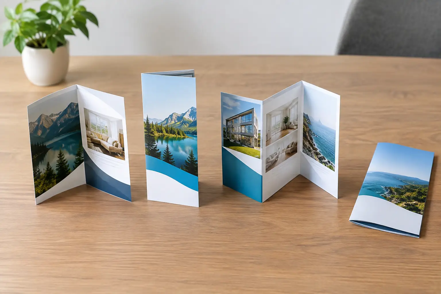
Digital marketing is essential, but physical brand materials still create a level of presence that a browser tab cannot always match. A professionally printed business card, an easy-to-read sign, a polished direct mail piece, or a useful promotional item puts your business in front of people when they are away from their screens.
The difference is intentionality. Businesses are moving away from handing out random giveaways and toward products that match their audience and sales process. A lender may use practical closing gifts and presentation folders. A home services company may benefit from branded magnets, door hangers, vehicle graphics, and leave-behind cards. A B2B team attending events may need coordinated displays, brochures, apparel, and follow-up materials.
A promotional product should earn its place in the budget. If it is useful, well-made, and tied to a clear campaign or customer relationship, it can extend visibility long after an event ends. If it is forgettable clutter, it will not build recall regardless of how many units you order.
Websites are becoming the center of brand proof
Many customers will check your website before they call, request a quote, or respond to a referral. They are looking for quick proof that you are established, professional, and able to solve their problem. A website does not need every possible feature, but it does need to make the next step easy.
Current branding trends favor websites with clear service pages, strong calls to action, mobile-friendly layouts, and visual alignment with offline materials. If the postcard promises dependable service but the site feels dated or confusing, the customer experience breaks down. The same is true when a trade show visitor scans a QR code and lands on a generic homepage instead of a relevant offer.
For some businesses, a focused landing page will outperform a large site because it supports one campaign, one audience, and one action. For others, especially companies with multiple services or locations, a more complete website is necessary. The right approach depends on how customers search, compare options, and make decisions in your category.
More human brand content is replacing stock-looking marketing
Customers respond to signs that a business is real. That includes photographs of your team, completed work, products in use, customer environments, and the people behind the service. Carefully selected stock images can still serve a purpose, but they should not make your company look interchangeable with every competitor in your market.
Human content does not require a high-production campaign every month. A consistent library of authentic photos can support your website, case studies, sales presentations, social media, brochures, and recruiting materials. It also gives your marketing a stronger connection to your local market and actual capabilities.
The key is quality control. Blurry job-site photos, inconsistent lighting, and casual images that do not fit your brand can hurt credibility. Plan photo capture around projects, events, team milestones, and new installations. A little preparation produces content you can use across multiple channels.
Personalization is becoming more practical
Personalization no longer means adding a first name to an email and calling it a campaign. It can mean creating different materials for different customer groups, industries, neighborhoods, referral partners, or stages of the buying process.
A developer marketing a new community may need distinct brochures, signage, web pages, and promotional items for buyers, real estate agents, and investors. A B2B provider may need one sales kit for manufacturing clients and another for professional services. The core brand stays consistent, while the message and proof points become more relevant.
This approach works best when it is organized. Without a clear brand foundation, personalization can create a new version of the same inconsistency problem. Start with approved design elements, a clear message hierarchy, and a plan for which materials serve which audience.
What to Avoid When Following Branding Trends
Not every trend deserves a place in your marketing. Rebranding because a competitor changed their logo, using a popular color without considering your audience, or adding new channels without the staff to maintain them can create more headaches than results.
Avoid treating your brand as a collection of isolated projects. A new website, fresh apparel, trade show booth, and direct mail campaign should not be separate creative decisions. They should reinforce the same promise and make it easier for people to recognize your business.
Also resist the temptation to prioritize appearance over clarity. A visually impressive piece that does not explain what you do, who you help, or how to contact you is not doing its job. Strong branding gets attention, but useful messaging turns attention into action.
Build a Brand System You Can Actually Use
The best branding trends support a practical system: a clear identity, reliable files, consistent messaging, and marketing materials built for real sales situations. Start by reviewing what customers see most often. That may be your website, vehicle graphics, proposals, business cards, storefront signage, trade show materials, or customer follow-up pieces.
Look for gaps between those touchpoints. Are your colors consistent? Is your logo clear and current? Does your website match the quality of your printed materials? Can employees order approved items without creating new versions on their own? These questions reveal where brand inconsistency is costing you trust, time, or opportunity.
Echo Brand Geeks helps businesses bring design, print, web, apparel, signage, and promotional products into one coordinated process. That means fewer disconnected vendors, fewer production mistakes, and a stronger presence across the places customers actually see your business.
Choose the trends that make your next customer interaction easier to understand, easier to remember, and easier to act on. That is how a brand becomes more than a look – it becomes a dependable part of your sales process.