
A customer can decide whether your business feels credible before they read a single product detail. They notice the logo, colors, photography, page speed, and how easily they can find what they need. The most useful ecommerce design trends are not about chasing a flashy look. They help customers feel confident enough to buy.
For small and mid-sized businesses, that distinction matters. Your website has to carry the same level of professionalism as your business cards, trade show display, vehicle signage, packaging, and sales materials. When every touchpoint looks like it came from a different company, customers notice. When it all works together, your brand becomes easier to remember and easier to trust.
Ecommerce Design Trends That Earn More Confidence
1. Clear, conversion-focused layouts
Busy layouts are losing ground to pages with a clear visual hierarchy. Customers should be able to answer a few basic questions quickly: What do you sell? Who is it for? Why should they choose you? What should they do next?
That does not mean every ecommerce site needs to look empty or generic. It means the design should direct attention with purpose. A strong headline, useful product imagery, visible pricing, a clear call to action, and scannable details will usually outperform a page packed with competing banners and messages.
For a local service business selling packages, branded merchandise, or specialized products, clarity can reduce costly drop-off. Put your best-selling categories and primary value proposition near the top. Save secondary information for lower on the page, where interested shoppers can find it without getting distracted.
2. Brand systems that carry across every channel
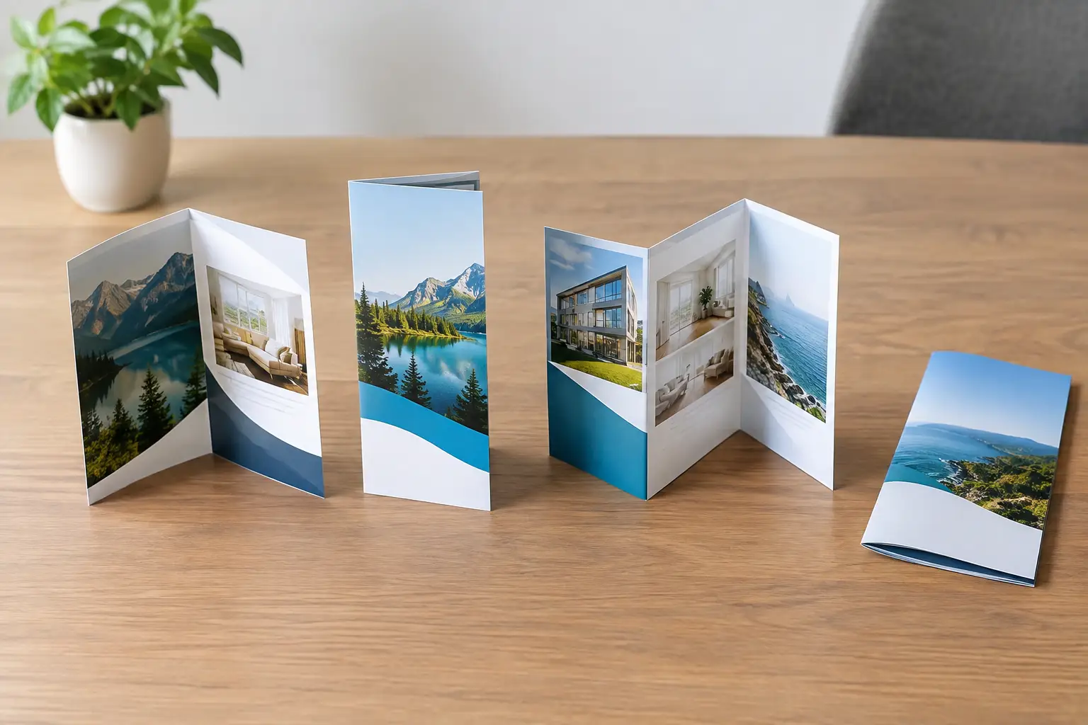
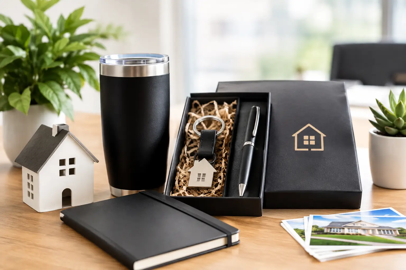
One of the most valuable design shifts is not a visual style. It is the move from one-off page design to a complete brand system. Your ecommerce site should use the same logo standards, colors, fonts, messaging, and image direction as your print materials and promotional products.
Consistency makes a business feel established. A customer who receives a postcard, sees your booth at an event, and later visits your online store should recognize the same company immediately. That recognition shortens the trust-building process.
The trade-off is that consistency needs structure. A brand guide, even a practical one, keeps teams from improvising new shades of blue, swapping typefaces, or using low-quality graphics when deadlines get tight. It also makes future website updates, print runs, and campaign launches faster to manage.
3. Authentic photography over generic stock visuals
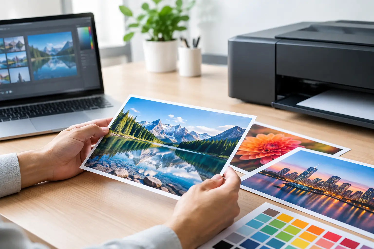
Customers want to see what they are buying, who they are buying from, and how a product or service works in real life. Clean product photography remains essential, but businesses are also using more real team photos, work-in-progress images, customer environments, and short videos.
For a contractor, lender, developer, or B2B provider, this may mean photos of your team meeting clients, completing projects, preparing orders, or working in your actual space. For retailers, it may mean showing products at a useful scale and from multiple angles.
Stock photography still has a place when it supports a specific message and fits the brand. The problem comes when stock images become a substitute for proof. If every photo could belong to any competitor, it does little to make your business memorable.
4. Mobile-first buying experiences
Mobile design is not a smaller version of desktop design. It requires its own decisions about navigation, buttons, product details, forms, and checkout. A customer shopping from a phone should not have to pinch, zoom, hunt for a filter, or fill out a long form to complete a purchase.
The practical approach is to prioritize the actions that matter most. Keep navigation simple, make tap targets large enough, use readable type, and place important information close to the purchase decision. Sticky add-to-cart buttons can be helpful on long product pages, especially when shoppers need to review options, specifications, or reviews before buying.
Test the experience on actual phones, not only a desktop preview. A page can look polished in a design mockup and still be frustrating when a real customer tries to select a variation or enter shipping information with one hand.
5. Faster pages with fewer distractions
Speed is part of design because it shapes how customers experience your brand. Heavy video files, oversized images, unnecessary animation, and too many third-party tools can make a site feel slow and unreliable. That is a poor first impression for a company asking visitors to share payment information.
A visually rich site can still be fast. The key is choosing assets carefully. Use well-sized images, limit motion to moments that add value, and avoid installing an app or pop-up for every marketing idea. Every feature should earn its place.
This is where trends require judgment. Motion effects and interactive elements can make a brand feel modern, but they should not delay the path to a product, quote request, or checkout. The right design is the one that supports the customer journey, not the one with the most effects.
6. Product pages built to answer objections
A product page is a sales conversation. Good ecommerce design gives shoppers the information they need before they have to ask for it. That includes clear photos, dimensions, materials, options, turnaround times, pricing context, shipping details, and return policies.
For custom products or business-to-business orders, it can also include artwork requirements, minimum quantities, setup expectations, and a simple path to request help. Hiding these details may create more inquiries, but it often creates the wrong kind: customers who are confused, unqualified, or frustrated after they have already invested time.
Use plain language. A buyer should not need industry knowledge to understand what they receive, how long it takes, or what happens after they place an order. Clear expectations protect your margins and reduce production mistakes.
7. Personalization that feels useful, not invasive
Relevant recommendations, recently viewed products, saved carts, and location-based information can make shopping easier. The best personalization removes effort. It helps a customer reorder a familiar item, find a compatible add-on, or return to a quote they started.
There is a line, though. Overly aggressive pop-ups, constant reminders, and recommendations that feel unrelated can make a site feel pushy. Small businesses often benefit more from simple, helpful personalization than complicated automation.
Start with the moments where customers commonly need support. If buyers often reorder branded apparel, make reordering easy. If they frequently combine products for an event, suggest related items after they add the first product to their cart. Let customer behavior guide the design rather than adding features because competitors have them.
8. Accessible design as a credibility standard
Accessible design improves the experience for more people, including customers using screen readers, keyboard navigation, or mobile devices in less-than-ideal conditions. It also makes information easier for everyone to understand.
Use strong color contrast, descriptive image text, clear headings, readable font sizes, and form fields with helpful labels. Avoid relying on color alone to communicate a sale, an error, or a product option. These choices are practical, professional, and often easier to maintain than overly complicated visual treatments.
Accessibility does not limit creativity. It asks design to work harder. A distinctive brand can still have bold color, strong personality, and visual impact while making sure customers can read, navigate, and buy with confidence.
How to Apply These Ecommerce Design Trends Without a Full Rebuild
You do not need to redesign your entire store to make meaningful improvements. Start by reviewing the pages closest to revenue: your homepage, top category pages, best-selling product pages, cart, and checkout. Look for places where a customer may hesitate, get confused, or lose trust.
Then compare your site to your offline materials. Does the visual identity match your business card, brochure, signage, presentation folder, or event display? Are your product photos and messages current? Can someone tell within a few seconds what makes your business different?
Prioritize fixes that reduce friction first. That may be better product photography, clearer shipping details, faster load times, improved mobile buttons, or a simplified request form. A new visual treatment can help, but it will not compensate for unclear pricing or a checkout that is difficult to use.
At Echo Brand Geeks, we see the strongest results when a website is treated as part of the full brand experience, not as a separate project. The same thinking that makes a trade show display clear and memorable can make an online product page easier to shop.
Your ecommerce site should make it easy for customers to recognize your business, understand the offer, and take the next step. Build around that standard, and design trends become useful tools instead of expensive distractions.