A shopper has landed on your product page, not your homepage. They are past the first impression and close to a decision. At this point, confusing information, weak photos, or an uncertain checkout path can cost you the sale. This ecommerce product page design guide focuses on the practical details that help small and mid-sized businesses turn product interest into confident purchases.
A strong product page does more than display an item. It answers questions, supports your brand credibility, and makes the next step obvious. Whether you sell branded apparel, promotional products, specialty goods, tools, or professional services with purchasable packages, the goal is the same: reduce hesitation without overwhelming the customer.
Start With a Page That Makes the Product Clear
Your customer should understand what you are selling within a few seconds. That sounds simple, but many pages bury the essential details under oversized graphics, vague headlines, or generic marketing copy.
Lead with a specific product name. “Custom Embroidered Quarter-Zip Pullover” is more useful than “Corporate Comfort.” A creative collection name can still have a place, but it should not force customers to guess what the product is. The same rule applies to service-based offers. Name the deliverable clearly before explaining its benefits.
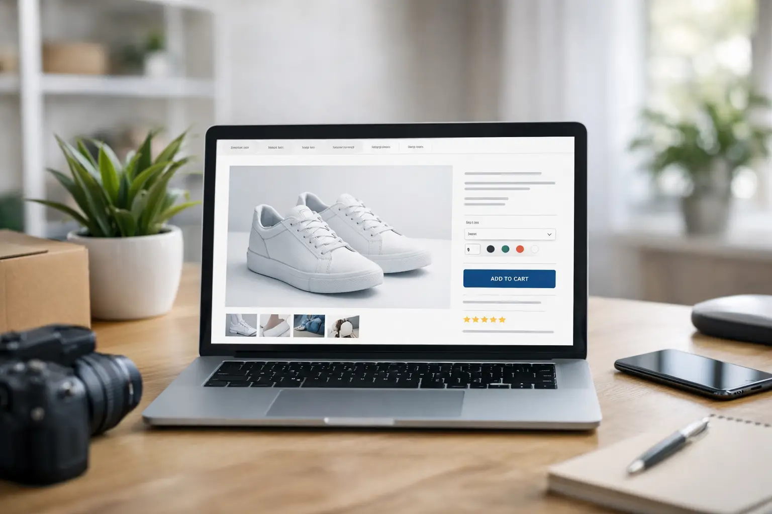
Place the price, primary image, key options, and add-to-cart button where shoppers expect to find them. Familiar layouts work because they lower the learning curve. You do not need to reinvent the buying process to make your brand memorable.
Clarity also means showing availability honestly. If an item is made to order, has a production lead time, or requires artwork approval, say so near the purchase decision. Hiding that information may earn a short-term order, but it creates support issues, disappointed customers, and avoidable refunds later.
Ecommerce Product Page Design Guide: Build Trust First
A product page must do the work a knowledgeable salesperson would normally handle. It should show the product, explain how it works, set expectations, and answer the questions that prevent someone from buying.
High-quality images are the foundation. Use enough photos to show the product from useful angles, not just enough to fill a gallery. Include close-ups for materials, texture, features, and finishes. If size matters, include an image that gives the customer scale. For apparel, show the garment on a person when possible. For printed pieces, show folded and opened views. For promotional products, show the imprint area and a finished example.
Consistency matters here. Product photography should reflect the same level of care as your website, business cards, signage, and trade show materials. When every customer touchpoint looks disconnected, buyers can question whether the business is established and dependable. A cohesive visual identity adds credibility before a customer reads a word.
Video can help when the product benefits from movement or demonstration. A quick clip of a bag’s compartments, a tumbler’s lid, or a shirt’s fit can answer questions still photos cannot. However, video is not required for every item. A poorly lit, shaky video can hurt trust more than it helps. Start with clean images and accurate information first.
Write Product Copy That Answers Buying Questions
The best product descriptions are not written to impress other marketers. They are written to help a real buyer decide whether the product fits their needs.
Start with a short paragraph that explains the main benefit. Then provide the practical details customers need to compare options and place an order. Avoid filler phrases such as “premium quality” unless you explain what makes the quality different. Is the material heavier? Is the print process more durable? Does the item include a warranty? Specifics are more persuasive than claims.
For a custom product, explain the ordering process in plain language. Tell customers what file types you accept, whether setup or proof approval is included, what happens after they place an order, and when they can expect delivery. If quantity affects unit price, make that relationship easy to understand.
A helpful description often covers material or construction, dimensions, available colors, customization details, care instructions, production timing, and intended use. You do not need to force every detail into a long paragraph. Use short sections and scannable labels so customers can find what matters to them.
The right amount of detail depends on the purchase. A low-cost impulse item may need a concise description and a few strong images. A higher-priced item, custom order, or business purchase usually needs more reassurance. The more risk a customer feels, the more clearly the page should answer their questions.
Make Options Easy to Choose
Variations can make a product more useful, but they can also create friction. If a shopper has to decode color names, guess at sizing, or hunt for pricing changes, they may abandon the page.
Use visual swatches when color is an important decision. Label options clearly, and make unavailable choices visibly unavailable rather than letting customers discover the problem at checkout. For sizes, provide a size chart close to the selection area. A generic “small through 3XL” list does not help someone determine fit.
For custom merchandise, separate required choices from optional upgrades. A customer should immediately understand what is included in the base price and what adds cost. For example, distinguish between one-color printing, additional imprint locations, rush production, and upgraded packaging. Clear options prevent surprise charges and reduce back-and-forth after the order arrives.
Do not overload one page with every possible configuration if the product requires consultation. In some cases, a streamlined request-for-quote path is better than a complicated add-to-cart experience. That is especially true for trade show displays, large print orders, or products with complex branding requirements. The right conversion is not always an instant purchase. It may be a qualified inquiry that your team can price accurately.
Give the Call to Action a Real Job
Your primary call to action should tell the customer exactly what happens next: “Add to Cart,” “Start Your Custom Order,” “Request a Quote,” or “Upload Your Artwork.” Vague labels such as “Learn More” are less effective on a page where the shopper is already evaluating a specific product.
Keep the main action visually prominent, especially on mobile. Many business buyers research products from their phones between meetings, at job sites, or while traveling. If the button is hard to find, covered by a pop-up, or separated from the product options, you are adding friction at the moment of intent.
Supporting information should sit near the action when it can reduce doubt. Production timelines, shipping estimates, return policies, proofing details, and secure payment messaging can all help. The key is restraint. Too many badges, banners, and competing messages create visual noise. Use the proof points that matter most to your customers.
Design for Mobile Without Sacrificing Detail
Mobile product pages need more than a responsive layout. They need deliberate choices about readability and usability. Text should be easy to scan, images should load quickly, and product options should be large enough to tap without mistakes.
Avoid forcing customers to pinch, zoom, or scroll through a wall of tiny specifications. Break information into logical sections, but do not hide critical facts inside so many collapsed tabs that shoppers miss them. Price, availability, key product features, and purchase controls should remain easy to reach.
Page speed is part of the experience, too. Large image files, unnecessary scripts, and excessive pop-ups can slow a page enough to lose impatient visitors. Optimize images while preserving enough quality for customers to inspect the product. This is a trade-off, not a reason to use blurry photos. The goal is fast, credible, and useful.
Use Reviews and Proof With Purpose
Reviews are valuable because they let customers hear from people who have already taken the risk. Display genuine feedback that speaks to quality, fit, turnaround time, customization, or customer service. A review saying “Great product” is nice. A review explaining that a company received event shirts on time and the logo looked sharp is far more useful.
If you are building a newer product catalog and do not yet have many reviews, use other forms of proof carefully. Show completed work, include clear production standards, and explain your process. Do not invent testimonials or inflate claims. Trust is hard to earn and easy to lose.
For B2B buyers, proof may also come from consistent brand presentation. When your online store, printed materials, packaging, and promotional products feel like they belong to the same company, customers see a business that is organized and prepared to deliver. That kind of consistency is often what separates a one-time transaction from a long-term account.
Check the Details Before You Send Traffic
Before investing in ads, email campaigns, or social promotion, test your product pages like a customer would. Select every variation, add items to the cart, test the page on a phone, and read the copy for unanswered questions. Make sure product images match the available options and that pricing updates correctly.
Pay close attention to the handoff from product page to checkout. A page can be well designed and still lose sales if shipping costs appear unexpectedly, discount codes malfunction, or the checkout asks for information that is not necessary. Each preventable mistake creates more support work and lowers confidence in your brand.
A product page does not have to be flashy to perform well. It needs to be clear, credible, and easy to use. Start by improving the page for your best-selling or highest-margin item, then use what you learn to create a consistent standard across the rest of your store. When every detail supports the same brand promise, customers have fewer reasons to hesitate and more reasons to buy.