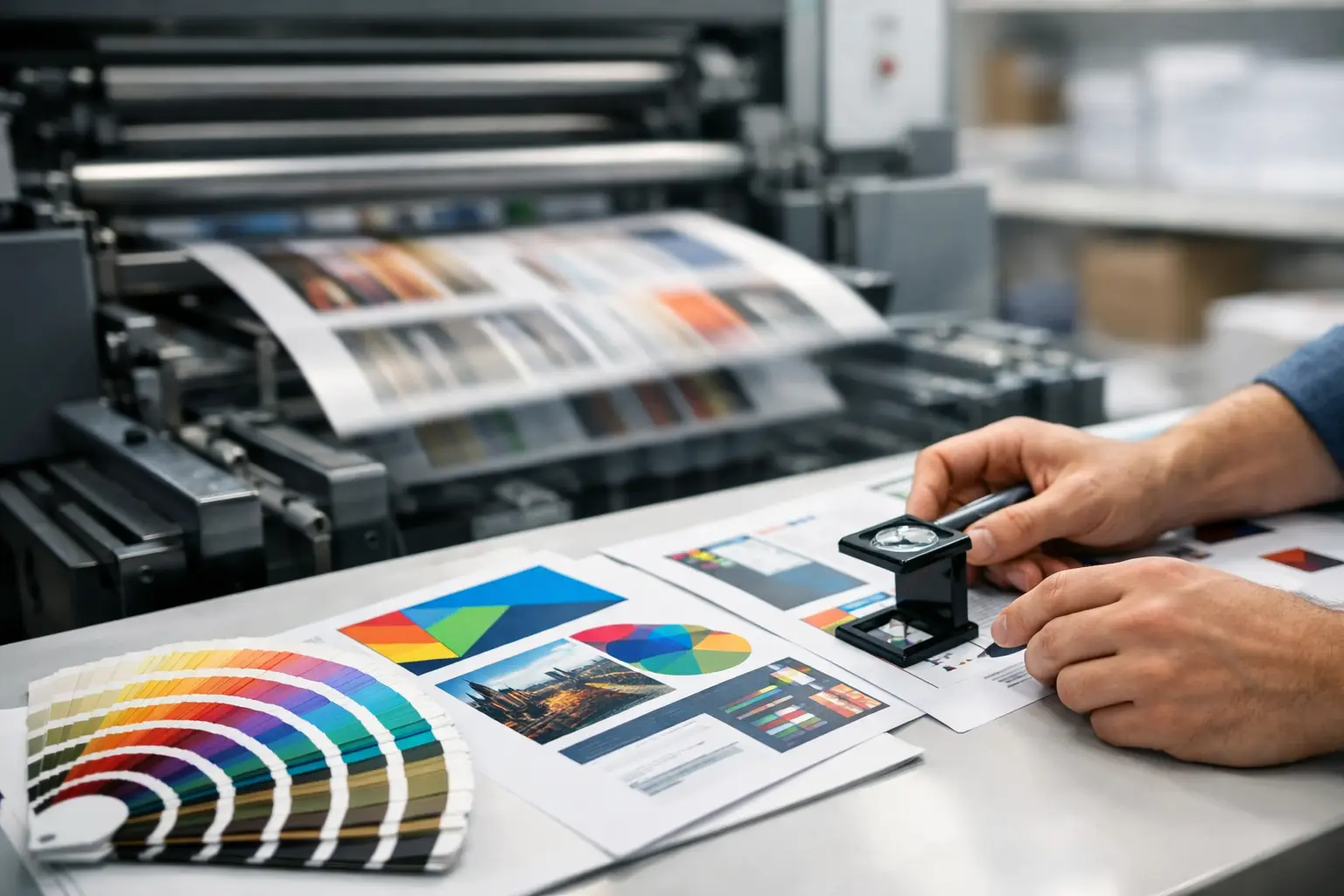
A brochure that looks sharp on screen can arrive with washed-out photos, a logo too close to the edge, or a fold that cuts through a headline. That is where a solid print production guide earns its value. Print is a physical representation of your business, and small production details can affect whether your brand feels polished, trustworthy, and ready to do business.
For small and mid-sized companies, the goal is not to become a print expert. The goal is to make smart decisions early, prevent expensive reprints, and ensure every card, sign, flyer, and trade show piece reinforces the same professional identity.
Start With the Job Your Print Piece Must Do
Before choosing paper stock, finishes, or formats, define what the piece needs to accomplish. A business card needs to be easy to keep and easy to read. A direct mail postcard needs to get attention quickly and move the recipient toward a clear next step. A trade show banner needs to communicate from several feet away, not reward someone for reading fine print.
This sounds basic, but it prevents a common mistake: designing for personal preference instead of real-world use. A heavy, premium card stock may support a financial advisor or luxury service brand. For a high-volume event handout, that same stock can raise costs without improving results. The right production choice depends on the audience, distribution method, budget, and lifespan of the piece.
Think about where the item will be seen and handled. Will it be mailed, displayed indoors, exposed to weather, handed out at a networking event, or placed at a front desk? Those conditions should guide every decision that follows.
Choose the Right Print Method
Most business print projects fall into two categories: digital printing and offset printing. Neither is automatically better. The best fit comes down to quantity, timing, color requirements, and the finished look you need.
Digital printing is often the practical choice for short runs, quick turnaround, variable data, and frequent updates. It works well for business cards, flyers, postcards, presentation folders, and targeted mailers where names, offers, or locations may change from piece to piece. It also avoids the setup costs associated with larger press runs.
Offset printing usually makes more financial sense at higher quantities and can provide excellent color consistency for brand-critical projects. It is commonly used for larger brochure runs, catalogs, packaging, and campaigns where every piece needs to match over time. Offset may require more lead time, so it is less forgiving when a deadline is already tight.
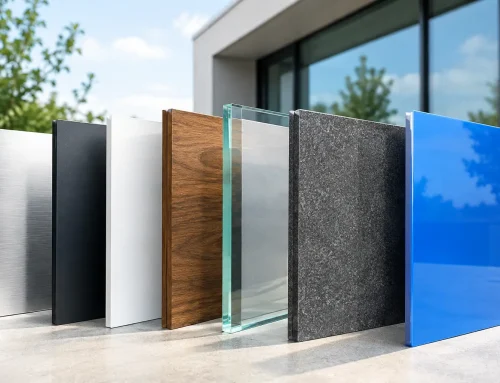
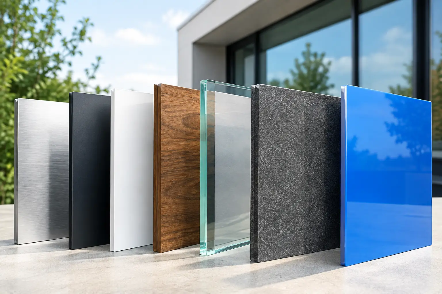
Specialty production can add impact when it supports your message. Large-format printing is built for banners, window graphics, signage, wall displays, and trade show materials. Screen printing and embroidery are often better suited to apparel. Foil, embossing, spot UV, die cutting, and textured stocks can create a memorable impression, but they should be purposeful. A premium finish can elevate a high-value proposal folder. On a crowded flyer, it may simply add cost.
Build Your Design for Real Print Conditions
Print files need more than an attractive layout. They need technical preparation that allows the piece to trim, fold, and reproduce correctly.
First, use the correct document size. A standard business card, a rack card, and a folded brochure all require different setup dimensions. If artwork extends to the edge of the final piece, include bleed. Bleed is extra image or color area beyond the trim line that prevents thin white edges after cutting. A common bleed amount is 0.125 inch, although the exact requirement can vary by product and printer.
Keep important content inside a safe area. Logos, phone numbers, web addresses, QR codes, and headlines should sit far enough from the trim line that minor cutting variation will not make them feel crowded or clipped. This matters even more on small products, where a fraction of an inch can change the visual balance.
Use high-resolution images. For most printed materials, photos and raster graphics should be 300 dots per inch at their final printed size. Pulling a small image from a website and enlarging it for a postcard is a reliable way to get blur or pixelation. For logos and icons, vector files are preferred because they can scale cleanly without losing quality.
Color also deserves attention. Screens use RGB light to create color, while commercial printing generally uses CMYK inks or toner. Bright screen colors, especially electric blues, greens, and oranges, may not reproduce exactly in print. If your brand relies on a precise color, communicate the approved CMYK and Pantone specifications from the start. Consistency is far easier to manage when your logo files, color values, and font choices are organized in one place.
Make Paper and Finish Work for Your Brand
Paper affects more than the weight of a piece. It changes color appearance, durability, readability, and perceived value.
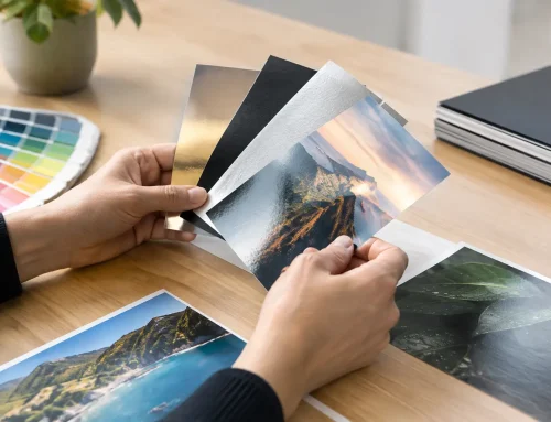
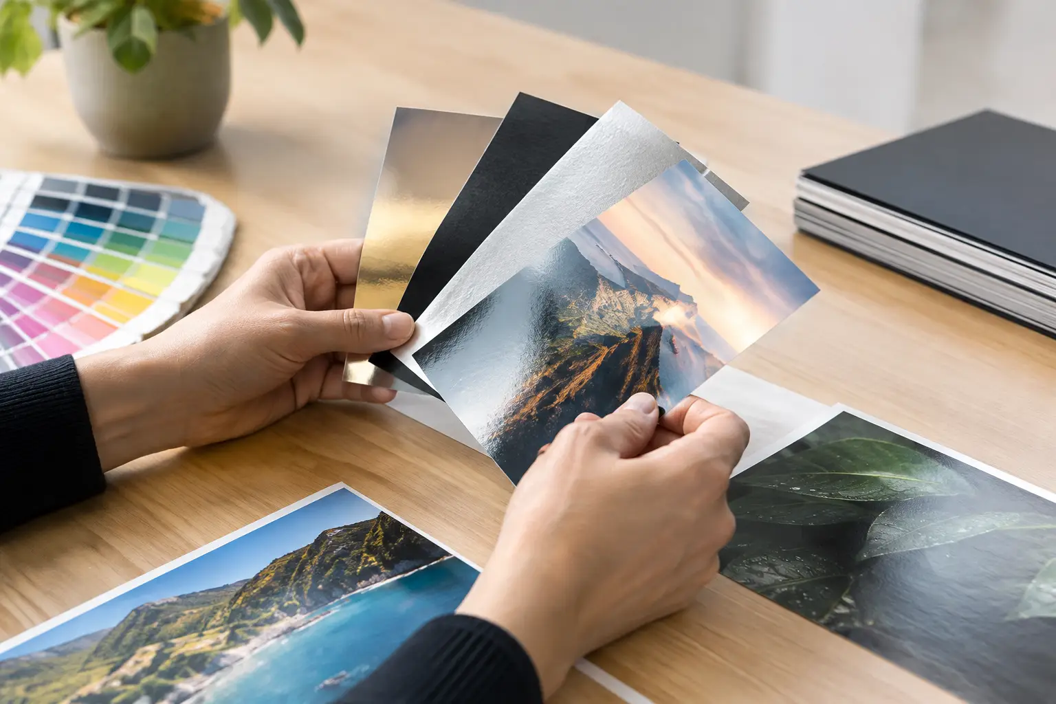
Uncoated stock has a natural, writable surface. It is a strong fit for appointment cards, forms, stationery, and pieces that need a more tactile or understated feel. Coated stocks, such as gloss or matte, can make photos and color graphics look more vibrant. Gloss provides shine and contrast, while matte offers a smoother, less reflective finish that can feel more refined.
Weight matters too. Lightweight text stock works well for flyers, letterhead, and inserts. Heavier cover stock is typically used for business cards, postcards, and durable marketing pieces. A thicker stock can add credibility, but only if it supports the use case. A thick tri-fold brochure may resist folding cleanly unless it is scored first.
Lamination can protect menus, frequently handled materials, and cards used in demanding environments. It can also make a piece feel more substantial. However, lamination adds cost and may complicate writing on the surface or recycling the finished product. Ask whether durability is truly needed before adding it.
Proof Before You Approve
The proofing stage is where production headaches are cheapest to fix. Never treat a proof as a formality, especially when a project includes a new format, a complex fold, a large quantity, or a brand launch.
A digital proof is useful for reviewing content, layout, spelling, and general placement. It may not perfectly represent final color, texture, or how a fold lands. For color-sensitive or high-stakes projects, a hard proof or press proof can be worth the added time and expense.
Review the proof with fresh eyes and with the final use in mind. Check contact information, legal language, service areas, URLs, QR codes, pricing, and dates. Confirm that the logo is the correct version and that all photos have permission for their intended use. If a brochure folds, print the proof at home and fold it. This simple step can reveal panel-order issues and awkward headline placement before production begins.
For a practical preflight review, confirm these five items before approval:
- The final size, bleed, safe margins, and fold or die-cut lines are correct.
- Images are high resolution and logos are clear at the intended size.
- Brand colors, fonts, and messaging match your approved standards.
- All contact details, calls to action, and QR codes have been tested.
- Quantities, turnaround times, shipping details, and finishing options match the order.
Plan Production Around Your Marketing Calendar
Rush printing can solve an emergency, but it should not become the standard operating model. Tight timelines limit your choices, increase shipping costs, and leave less room for proofreading or revisions. They can also force you into a stock, finish, or production method that does not fit the project.
Work backward from the date the materials must be in hand, not the date you want to place the order. Include time for design, internal feedback, revisions, proof approval, production, shipping, and a small buffer. Trade shows, property launches, seasonal promotions, grand openings, and direct mail campaigns all benefit from early planning.
This is also where centralized project management makes a real difference. When design, print, promotional products, signage, and digital campaign materials are coordinated together, the colors, offers, and timing are easier to control. Instead of sending a logo file to several vendors and hoping each one interprets it correctly, you can manage one consistent brand system across every customer touchpoint.
Avoid the Costs That Do Not Show Up on the Quote
The lowest unit price is not always the lowest total cost. A cheap flyer that uses an outdated offer, a banner with unreadable text, or cards with incorrect contact information cost more than the reprint. They can cost opportunities, credibility, and staff time.
Order quantities thoughtfully. Large-volume pricing can be attractive, but marketing materials become obsolete when team members change, services evolve, or a new campaign starts. For stable items like branded envelopes or core brochures, larger runs may be smart. For pricing sheets, event materials, and temporary offers, shorter runs can reduce waste.
Keep approved brand assets current and accessible. That includes logo variations, color formulas, fonts, photo libraries, messaging guidelines, and templates for common items. A clean brand library speeds up future projects and reduces the risk of someone using an old logo or recreating a design from scratch.
Use Print as Part of a Connected Brand Experience
Print works harder when it supports the rest of your marketing. A postcard should reflect the landing page it promotes. A trade show display should match the messaging on the sales team’s leave-behind materials. Branded apparel and promotional items should use the same logo standards as your website and signage.
That connection does not mean every item needs the same layout. Different formats require different priorities. It means your audience should recognize your company quickly, whether they see a yard sign, receive a mailer, visit your website, or meet your team at an event.
A well-produced piece does not have to be flashy. It has to be accurate, easy to understand, durable enough for its job, and unmistakably yours. Give the planning and proofing process the attention it deserves, and your next print project can build confidence before the conversation even begins.