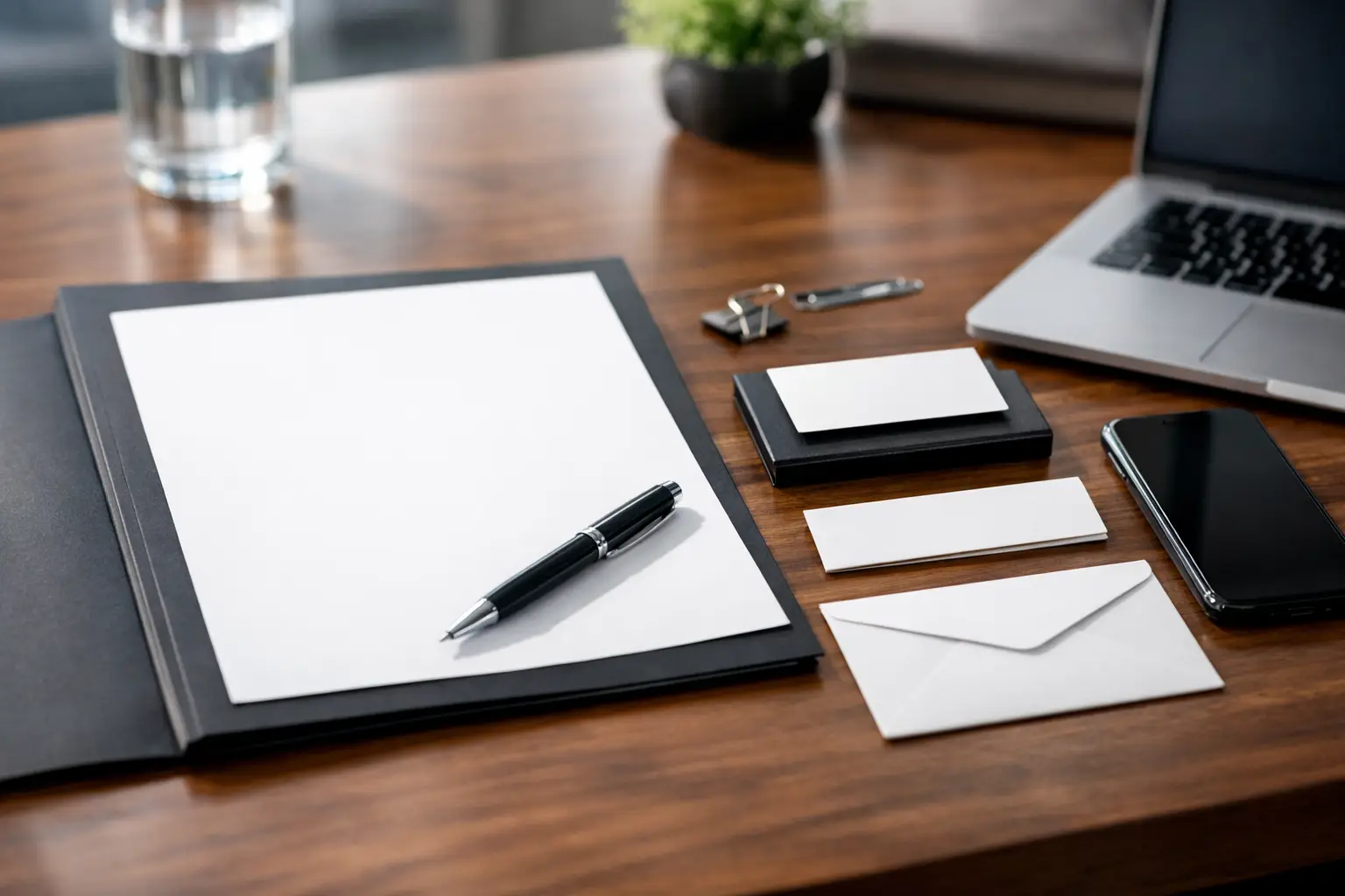
A business card handed across a desk, a letterhead attached to a proposal, and an envelope arriving in the mail may seem like small details. To your customer, they are proof that your business is organized, established, and ready to deliver. Learning how to design business stationery is less about decorating paper and more about creating a system that makes every interaction feel professional.
For small and mid-sized businesses, stationery is often where brand inconsistency becomes visible. A logo looks one way on a business card, another way on an invoice, and nowhere close to either version on a sales letter. That disconnect can make a capable company look less prepared than it is. A coordinated stationery suite gives your team practical tools while helping prospects remember who they are working with.
Start With the Brand Before You Start the Layout
Business stationery should not be the place where you decide what your brand looks like. Before anyone selects paper, adds a QR code, or rearranges contact information, establish the core visual elements: your approved logo, brand colors, typefaces, image style, and voice.
Your logo needs versions built for real production. A wide horizontal logo may work well on letterhead but feel cramped on a standard business card. A stacked version may fit better in narrow spaces. You may also need a one-color version for economical printing, engraving, embossing, or documents that will be reproduced in black and white.
Color deserves the same planning. Screen colors and printed colors do not always match exactly, especially when a design moves from a website to paper. Specify the color values your printer needs, whether that is CMYK for full-color print, Pantone for precise spot-color matching, or both. This prevents a familiar blue from turning purple on one item and muted gray on another.
Typography also carries more weight than many businesses expect. Choose a readable primary typeface for headlines and a practical supporting typeface for names, addresses, and body copy. If a font is difficult to read at small sizes, it will create problems on business cards and return addresses. Clean, legible type builds more credibility than a trendy font that asks people to work to understand it.
How to Design Business Stationery as One System
The most effective stationery packages are designed together, not as separate projects completed months apart. Think of the pieces as a coordinated set with a common visual structure. The logo placement, color use, spacing, and type hierarchy should feel related even when the format changes.
A typical business stationery system includes business cards, letterhead, envelopes, and notecards. Depending on your operation, it may also include presentation folders, invoice templates, proposal covers, mailing labels, appointment cards, rack cards, and branded forms. You do not need every item on day one. You do need a clear visual standard so future pieces do not look improvised.
Create a simple hierarchy for every piece. Your company name and logo should be immediately recognizable. The recipient should then be able to find the person’s name, role, phone number, email, website, and address without scanning a crowded layout. On a business card, that may mean giving the person’s name priority and placing secondary information on the reverse side. On letterhead, it may mean keeping the header restrained so the message has room to breathe.
White space is not wasted space. It makes information easier to scan, lets your logo stand out, and keeps a printed piece from looking like a template packed with every possible detail. This matters especially for service businesses, real estate professionals, lenders, contractors, and B2B companies whose materials need to communicate confidence quickly.
Design Each Piece for Its Job
A business card is a handoff tool, not a miniature brochure. Include the contact details that make the next step easy, then stop. If you have a strong call to action, such as scheduling a consultation or viewing available properties, a QR code can work well. It should lead to a mobile-friendly, relevant destination rather than a generic homepage.
Letterhead is built for correspondence, proposals, agreements, and formal documents. It needs to look polished without competing with the content. A large, colorful header may look impressive on screen but can consume valuable writing space and increase printing costs. A lighter header with a well-placed footer often gives you more flexibility.
Envelopes matter because they create the first impression before the recipient reads a word. Keep the return address clear, allow enough space for postal requirements, and use branding that supports recognition without making the envelope look overly promotional. If you mail invoices, contracts, or important client documents, a professional envelope reinforces that the contents deserve attention.
Notecards and thank-you cards are useful when a personal touch can move a relationship forward. A short handwritten note after a meeting, closing, referral, or completed project can be more memorable than another automated email. The card should feel consistent with the rest of your stationery while leaving enough room for a real message.
Make Smart Print Decisions Early
Great design can lose impact when the production choices are wrong. Paper stock, finish, ink coverage, and finishing methods all affect how your brand is perceived and what the finished piece costs.
For everyday business cards, a substantial uncoated or matte stock often feels professional and is easy to write on. Gloss can make colors appear more vivid, but it may show fingerprints and can be harder to write on. Soft-touch finishes feel premium, though they can add cost and are not always necessary for high-volume cards.
Letterhead needs a stock that runs reliably through office printers if your team will print proposals or letters in-house. Very heavy or textured paper can look impressive, but it may jam printers or make routine use expensive. For many businesses, a quality uncoated sheet offers the right balance of polish, function, and cost control.
Ask for printed proofs when color accuracy, fine details, or large print quantities are involved. A digital proof checks spelling, placement, and basic appearance, but a physical proof shows how the paper, ink, and finish actually work together. This extra step can prevent expensive reprints and production delays.
Build for Consistency Across Print and Digital
Your stationery does not exist apart from your website, email signature, social profiles, signage, trade show display, and promotional products. A prospect may see your website first, receive your card at a meeting, then get a proposal on your letterhead. Those touchpoints should make it obvious they came from the same business.
That does not mean every item must look identical. Digital channels need different layouts and behaviors than printed materials. The goal is recognizable consistency: the same logo rules, color family, typography, message, and level of professionalism. When those elements align, your marketing feels intentional instead of pieced together.
This is also where working from approved brand files makes a difference. Stretched logos, outdated phone numbers, random fonts, and recreated artwork are common sources of mistakes. Keep current files organized, name them clearly, and set rules for who can update contact details or order reprints. A reliable print and branding partner can manage those details so your team spends less time chasing vendors and correcting preventable errors.
Avoid the Common Stationery Mistakes
The first mistake is trying to fit everything onto every item. A business card does not need a full list of services, five phone numbers, three web addresses, and a paragraph about your company. Prioritize what helps a customer contact you or understand your role.
The second is designing only for the screen. Fine lines, tiny text, low-resolution images, and edge-to-edge artwork can create trouble in print. Build files with proper bleed, safe margins, and high-resolution artwork from the beginning.
The third is ordering before proofreading. Check every name, title, phone number, email address, URL, suite number, and license number. Have another person review it too. A typo on a digital page is easy to correct. A typo on 2,000 business cards is an avoidable cost.
Finally, do not treat stationery as a one-time order. Review it when your team grows, your services shift, your website changes, or your brand receives an update. Keeping these materials current protects the credibility you worked to earn.
Well-designed stationery gives your business a dependable presence in the moments that matter: the introduction, the follow-up, the proposal, and the thank-you. When every piece is clear, consistent, and built to print correctly, your brand does more than look polished. It makes doing business with you feel easier.