
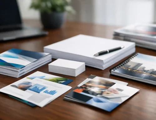
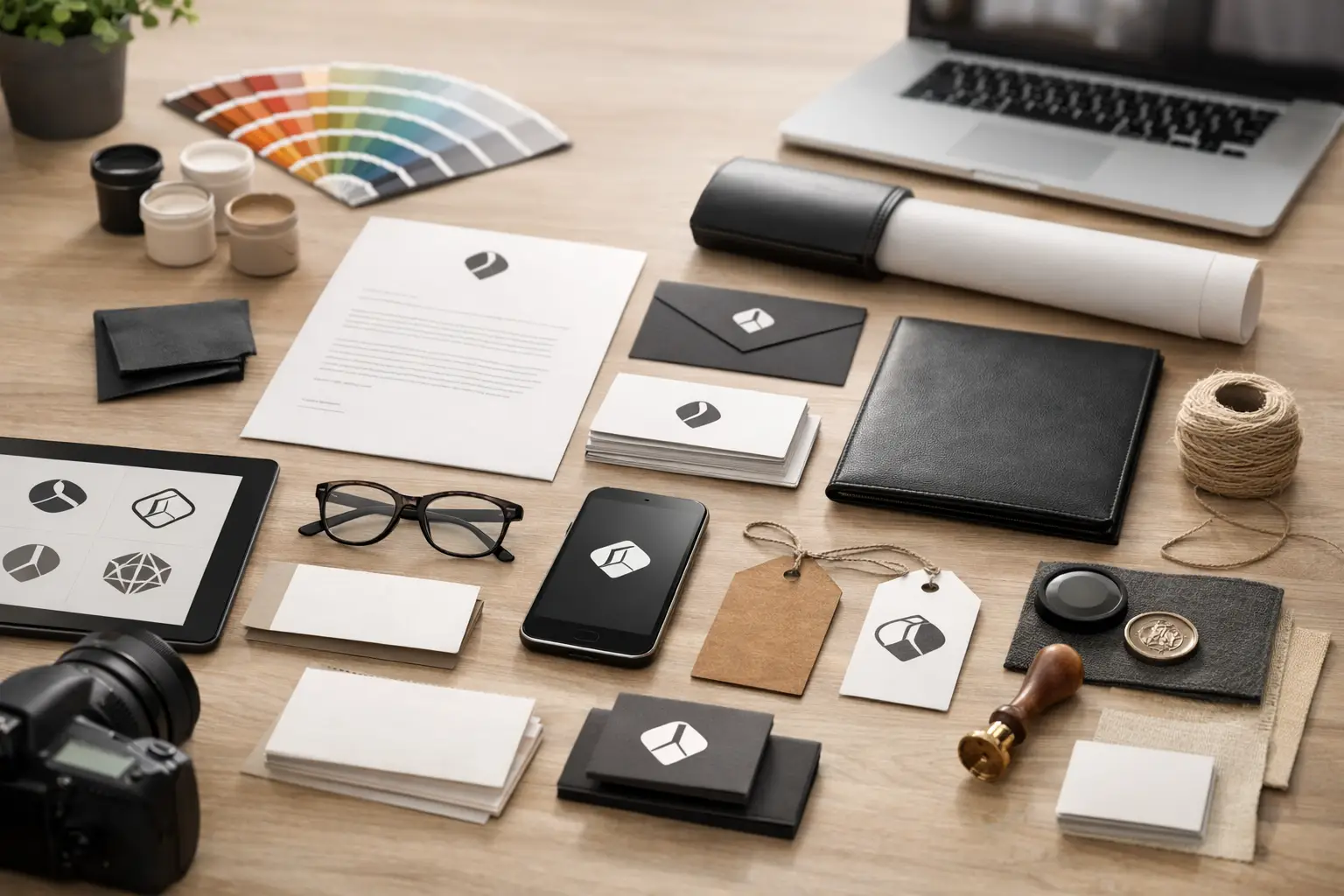
A logo usually looks simple when it is finished. That is exactly why many business owners underestimate what goes into it. A strong mark has to look right on a website header, a business card, a storefront sign, a trade show banner, a shirt, and a social profile. The professional logo design process is not about making something pretty. It is about building a visual asset your business can actually use without constant fixes, confusion, or expensive rework.
For small and mid-sized businesses, that distinction matters. If your logo only works in one setting, it creates headaches everywhere else. You end up adjusting colors for print, redrawing files for embroidery, swapping fonts on marketing pieces, and explaining your brand differently to every vendor. A professional process prevents that before it starts.
Why the professional logo design process starts with business reality
A good logo project does not begin in design software. It begins with questions about your business, your customers, and where the logo needs to perform. If you are a contractor, lender, developer, law office, medical practice, or local service provider, your logo has a job to do. It must communicate credibility fast and hold up across the materials that support sales.
That means the designer needs context. What do you sell? Who are you trying to reach? Where will the logo appear most often? Do you need it to feel established, modern, premium, approachable, technical, or bold? A startup trying to look disruptive may need a very different solution than a company whose main goal is trust and professionalism.
This is where many cheap logo options fall apart. They skip strategy and go straight to decoration. You may get a mark that looks trendy on screen but feels weak on a yard sign or impossible to reproduce on promotional products. The result is not just a design problem. It becomes an operations problem.
Discovery shapes the right direction
The discovery phase is where the professional logo design process earns its value. This is the point where preferences get separated from actual business needs. A client might love a certain style, but if it clashes with customer expectations or becomes unreadable in common use, it is the wrong choice.
During discovery, a designer usually reviews your market position, competitors, target audience, brand personality, and practical applications. That practical part matters more than people think. A logo for a digital-only business has different demands than one for a company using fleet graphics, apparel, packaging, signage, print collateral, and branded giveaways.
This phase also helps uncover internal brand inconsistencies. Sometimes the logo is not the only issue. The business may also be using different colors, fonts, taglines, or visual styles across its materials. Getting clear on the logo early helps create consistency later across websites, printed pieces, and promotional items.
Concept development is more than making options
Once the strategy is clear, concept development begins. This is where ideas start to take shape through sketching, typography exploration, symbol development, and composition testing. The goal is not to show the most options possible. The goal is to present directions that solve the problem in different smart ways.
A strong concept usually balances recognition, simplicity, and flexibility. It should feel distinct without becoming gimmicky. It should be memorable without relying on visual tricks that age quickly. That balance is harder than it sounds.
There is always a trade-off between uniqueness and usability. A highly intricate logo may look custom and impressive at first glance, but it can fail when reduced for a social icon or stitched onto apparel. On the other hand, a design that is too plain may disappear next to competitors. The right answer depends on your industry, your audience, and how the mark will be used every day.
Refinement is where weak logos get exposed
Initial concepts are only the starting point. Refinement is where the best direction gets tested, adjusted, and strengthened. This stage can include changes to line weight, spacing, scale, font selection, icon shape, color relationships, and how the logo works in horizontal and stacked formats.
This is also where business owners should expect a real conversation, not just a file delivery. Feedback matters, but useful feedback goes beyond saying you like or dislike a color. The better question is whether the design feels aligned with your market, communicates the right message, and works in the places you need it most.
A professional designer should also pressure-test the logo in realistic settings. Does it remain readable at small sizes? Does it still work in black and white? Can it be reversed out on dark backgrounds? Will it print cleanly? Does it hold up on signs, business cards, and digital layouts without losing impact?
These checks are not extra polish. They are what keep a logo from creating future production problems.
The professional logo design process must account for production
This is one of the biggest differences between a design-only approach and a full-service branding partner. A logo is not finished when it looks good in a presentation. It is finished when it is ready for real-world use.
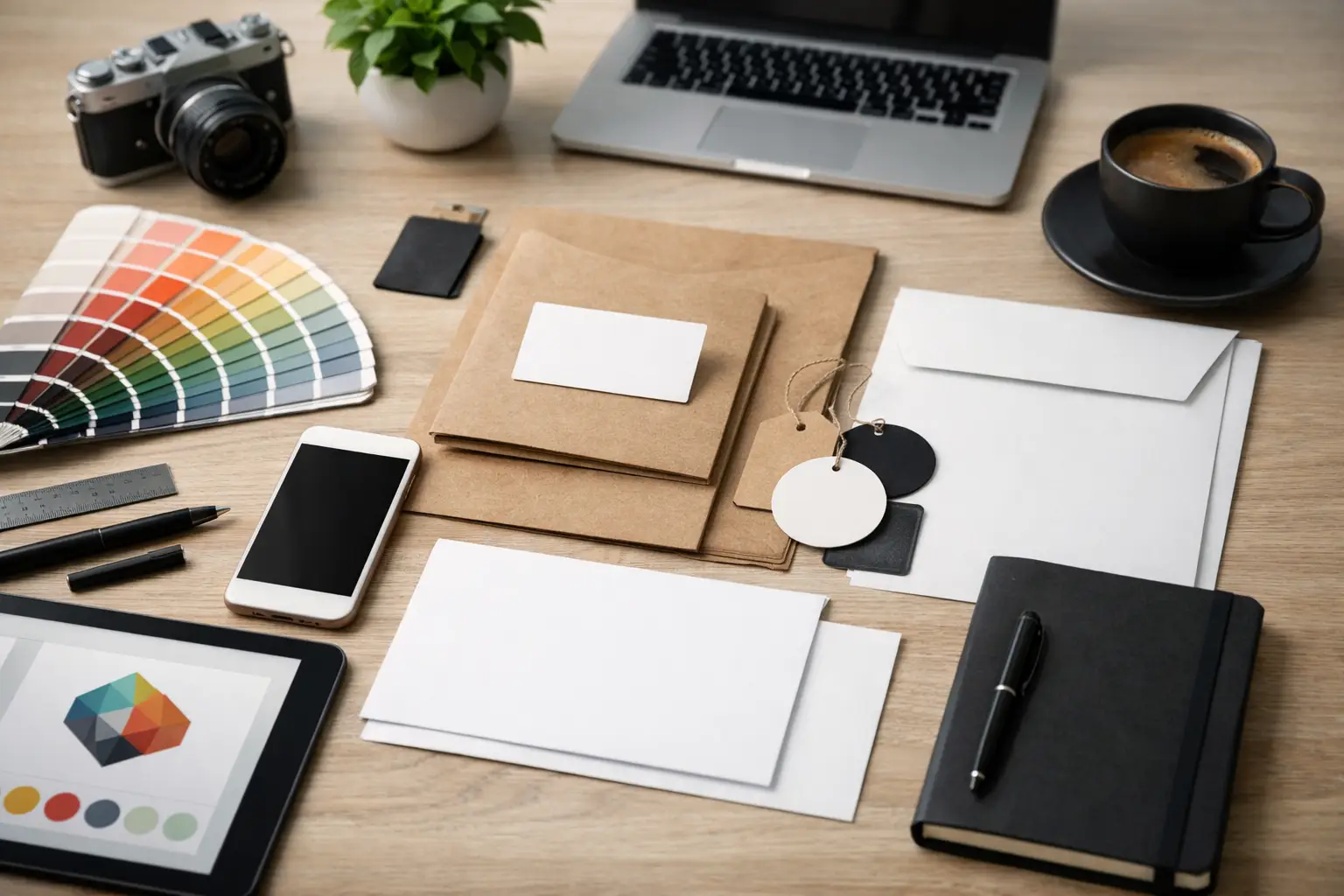
That means finalizing the proper file types, color modes, layout variations, and usage standards. A business will typically need vector files for print and scaling, web-friendly files for digital use, and versions that work across light backgrounds, dark backgrounds, one-color applications, and specialty production methods.
If your logo is going onto uniforms, embroidered hats, decals, brochures, trade show displays, vehicle graphics, postcards, or storefront signage, production realities matter. Fine details may need adjustment. Colors may need to be matched for print consistency. Spacing that looks good on a monitor may not hold up on physical materials.
This is why having branding, print, digital, and promotional execution connected can save time and money. When the same team understands how the logo will be used across channels, there is less backtracking and fewer expensive surprises. That practical connection is where businesses often see the biggest payoff.
Good logo design supports the rest of your brand
A logo is important, but it is not your whole brand. It is the anchor point that helps the rest of your marketing feel consistent. Once the logo is established, it becomes easier to build matching business cards, brochures, websites, social graphics, signage, and promotional products that feel like they belong to the same company.
That consistency does more than make things look polished. It builds trust. People notice when your materials feel coordinated and professional. They also notice when your postcard looks different from your website, or when your trade show banner uses a different color palette than your business card.
This is where many businesses lose momentum. They invest in a logo, then let every follow-up piece get handled by different vendors with different interpretations. Over time, the brand drifts. Working with a partner that can carry the visual identity into print, digital, and merchandise helps protect the original investment.
What business owners should expect from the process
If you are hiring for logo design, expect clarity, collaboration, and a focus on use, not just style. You should be asked smart questions. You should see concepts tied to your business goals. You should get revisions that improve performance, not just cosmetic changes.
You should also expect honesty. Sometimes the right logo is not the flashiest option. Sometimes your favorite concept is the one most likely to cause issues in print or on signage. A good partner will explain those trade-offs clearly so you can make a better decision.
At Echo Brand Geeks, that practical mindset matters because the logo is rarely the end of the job. It often needs to flow directly into the materials that drive visibility and sales. When the design process accounts for that from day one, businesses get a brand asset that works harder and causes fewer problems.
A strong logo saves work later
The best outcome of a professional logo project is not just a polished mark. It is fewer marketing headaches. It is knowing your logo will reproduce correctly, stay consistent across vendors, and support future materials without constant redesign. That makes every next step easier, whether you are ordering apparel, updating your website, printing sales sheets, or setting up for an event.
A good logo should add credibility to your business and make your brand memorable. More importantly, it should be built for the way your business actually operates. When the professional logo design process is handled the right way, you do not just get a better logo. You get a stronger foundation for everything that comes after.

