

If your business cards look polished, your website feels like a different company, and your trade show banner uses a third version of your logo, you do not have a marketing problem – you have a brand consistency problem. That is exactly why business owners ask what should a brand kit include. A strong brand kit gives your team, printer, web developer, and promotional vendor the same playbook, so your business shows up consistently wherever customers see it.
What should a brand kit include for a growing business?
At the most practical level, a brand kit should include the core visual and messaging standards your business needs to stay recognizable and professional. That usually means logo files, color codes, typography, image direction, brand voice guidance, and rules for how everything gets used across print, web, signage, apparel, and promotional products.
The exact contents depend on your business. A local contractor may need truck graphics, yard signs, and estimate templates. A lender may need presentation materials, social graphics, and compliance-friendly layouts. A retail business may need packaging, ecommerce graphics, and branded inserts. The point is not to build a giant document for the sake of it. The point is to reduce mistakes, speed up production, and protect the look and feel of your brand.
Start with the logo system
Most businesses think a brand kit starts and ends with the logo. It does not, but the logo system is still the foundation. Your kit should include the primary logo, secondary logo variations, a simple mark or icon if one exists, and approved versions for light and dark backgrounds.
File types matter more than many business owners realize. You want vector files for print and scaling, plus web-friendly formats for digital use. If your team only has a low-resolution PNG pulled from an email three years ago, you are setting yourself up for blurry signage, distorted apparel printing, and wasted time.
A good kit also explains logo spacing, minimum size, and what not to do. Stretching the logo, changing colors, adding effects, or placing it over a busy image may seem like small issues, but these are the details that make a brand look sloppy fast.
Brand colors should be clearly defined
Your colors should never be left to guesswork. A proper brand kit includes primary colors, secondary colors if needed, and the exact values for each one. That means CMYK for print, RGB for screen use, HEX for web, and often Pantone if color matching matters for signage, apparel, or promotional items.
This is where many businesses run into expensive inconsistencies. The blue on a brochure may not match the blue on a polo shirt if vendors are working from vague descriptions instead of exact specifications. If your business depends on a polished appearance, especially in competitive local markets, these details are not cosmetic. They affect trust.
Color guidance should also show how much each color gets used. Some brands have one dominant color and one accent. Others need a broader palette because they produce more varied marketing materials. The right approach depends on how simple or expansive your brand system needs to be.
Typography belongs in every brand kit
Fonts shape how professional your business feels. Your brand kit should name the primary typefaces for headlines, subheads, and body copy, along with acceptable alternatives if the main font is not available.
This section does two jobs. First, it creates consistency. Second, it prevents random substitutions that make materials look disconnected. If your brochure uses one font family, your website uses another, and your sales sheet uses a third because someone picked what was already installed, your brand starts to feel improvised.
It also helps to include basic usage rules. Which fonts are best for print? Which are intended for digital? Are all caps acceptable for headlines? What font weights should be used? These are small decisions that save a lot of back-and-forth later.
Messaging guidelines are just as important as visuals
A brand kit is not only about design. It should also include the core messaging that keeps your brand recognizable in writing. That means your brand promise, a short company description, tone guidance, tagline if you use one, and a few examples of approved messaging.
This matters because many businesses look consistent visually but sound different from one channel to the next. The homepage may be polished, while a postcard feels generic and a social ad sounds overly casual. Customers notice that disconnect even if they cannot explain it.
If your brand voice is direct, helpful, and results-focused, your kit should say so plainly. It should show how that voice appears in real materials, such as headlines, calls to action, and short service descriptions. For businesses that rely on multiple people to create content, this section can prevent a lot of mixed messaging.
Image style and graphic direction keep materials aligned
If you use photography, illustrations, patterns, icons, or other visual elements, your brand kit should define them. This section does not need to be complicated, but it should answer a simple question: what should our brand look like beyond the logo?
For some companies, that means bright, clean photography with real people and minimal stock-photo energy. For others, it may mean bold graphic overlays, technical diagrams, or polished product-focused imagery. The right answer depends on your audience and the kind of credibility you need to build.
This is especially useful when your marketing appears across multiple formats. A website hero image, a trade show backdrop, a direct mail piece, and a branded tumbler do not use visuals the same way. Without guidance, each vendor or team member will fill in the blanks differently.
Include real-world applications, not just rules
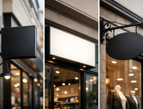
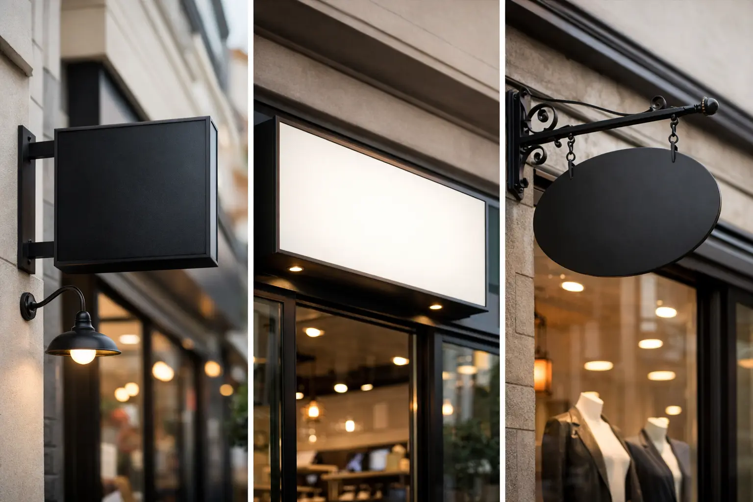
One of the most useful parts of a brand kit is seeing the brand applied to actual materials. This can include business cards, letterhead, email signatures, postcards, brochures, presentations, social graphics, signage, vehicle wraps, apparel, packaging, and trade show displays.
This section bridges the gap between strategy and execution. It gives your team a visual reference for how the brand should show up in the places where customers actually encounter it. It also reveals whether your brand system is practical. Some brands look fine in a style guide but fall apart when applied to embroidered shirts or outdoor banners.
If your business uses a mix of print, digital, and promotional products, this part becomes even more valuable. A brand kit should support production, not just appearance.
What should a brand kit include when multiple vendors are involved?
If you work with different providers for print, web, signage, apparel, or marketing, your brand kit should include production-ready standards. That means approved file versions, layout preferences, image specifications, and any practical notes that reduce interpretation errors.
This is where a business can save real money. When vendors have clear assets and instructions, projects move faster and reprints become less likely. When they do not, you end up reviewing inconsistent proofs, correcting avoidable mistakes, and paying for delays that should never have happened.
For many small and mid-sized businesses, the value of a brand kit is not theoretical. It is operational. It keeps projects organized and helps every piece of marketing work together instead of competing with itself.
Keep it right-sized for your business
Not every brand kit needs to be a 60-page manual. A newer business may only need a lean, well-organized system with logos, colors, fonts, messaging basics, and a few sample applications. A more established company with several service lines, locations, or marketing channels may need a deeper set of standards.
The mistake is going too light or too heavy. Too light, and your team still guesses. Too heavy, and nobody uses it. The best brand kit is the one your business can actually apply in everyday work.
That is why many companies benefit from building a kit around how they really market themselves. If you rely on print collateral, event materials, web pages, and branded merchandise, your standards should reflect that reality. A useful kit supports sales activity, daily marketing, and vendor coordination.
The goal is consistency that saves time
When people ask what should a brand kit include, they are often really asking how to make marketing easier without sacrificing quality. The answer is not more files sitting in a folder somewhere. The answer is a clear system your business can use again and again.
A solid brand kit helps your company look more credible, make faster decisions, and avoid the expensive mess that happens when every project starts from scratch. At Echo Brand Geeks, that is the difference between marketing that creates headaches and marketing that actually helps your business grow.
If your current materials feel disconnected, start by tightening the basics and building a kit your team can use in the real world. The more practical it is, the more valuable it becomes.


