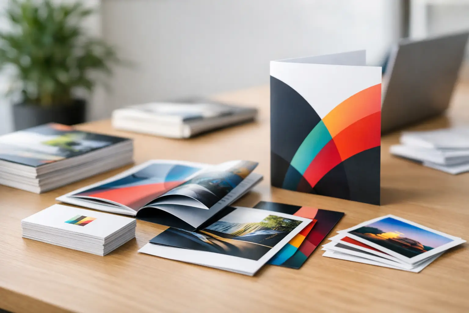
A business card exchanged after a meeting, a postcard pulled from the mailbox, and a banner seen from across a trade show floor all have one job: make the next step feel easy. Strong print design turns those brief moments into credibility, recognition, and action. Weak materials do the opposite. They make a capable business look unprepared, unclear, or easy to forget.
For small and mid-sized businesses, print is not a leftover from an earlier marketing era. It is a practical part of the sales process. It gives prospects something they can hold onto, share with a decision-maker, bring to an appointment, or reference when they are ready to buy. The difference is not simply whether your materials look attractive. It is whether they make your brand easier to understand and trust.
Print Design Starts With a Clear Job
Before choosing colors, paper, or a layout, decide what each piece needs to accomplish. A business card should make it effortless to remember who you are and contact you. A brochure should answer the questions a prospect will ask before calling. A direct mail postcard should create enough interest to earn a response. Trade show signage should communicate your value from several feet away, not require visitors to read a paragraph.
When one piece tries to do everything, it usually does nothing particularly well. A flyer packed with every service, every credential, and every offer may feel complete internally, but it can overwhelm the person receiving it. Clear print materials lead with the message that matters most, then give the reader a logical path to learn more or take action.
This is where a professional design process saves time and prevents expensive reprints. The right questions come first: Who will receive this? What do they need to know? What should they do next? Where will they see it? The answers shape the size, format, content, and visual hierarchy of the piece.
Consistency Makes Print Design Work Harder
A single polished postcard is useful. A connected set of materials is far more valuable. When your business cards, brochures, signage, apparel, presentation folders, and website all use the same visual language, prospects begin to recognize your brand faster. That familiarity adds credibility before a sales conversation even begins.
Consistency does not mean every item needs to look identical. A trade show display has different needs than a rack card, and a real estate listing postcard should not be designed like a B2B capabilities brochure. The goal is to keep the core elements aligned: logo use, colors, typography, image style, tone, and key messages.
Think of your brand as a system, not a collection of individual files. If your logo changes colors from one item to the next, your phone number is hard to find, or your service descriptions vary by vendor, your market presence starts to feel fragmented. That creates friction for your audience and headaches for your team.
A centralized creative and production partner can help protect that system. Echo Brand Geeks helps businesses coordinate design, print, digital assets, and promotional products so the materials people see in different places still feel like they came from the same company.
Make the Most Important Message Easy to Find
Good design directs attention. It tells a reader where to look first, what to understand second, and how to respond. This is called visual hierarchy, but the business value is simple: people should not have to work to understand what you offer.
Start with one clear headline or primary message. A local contractor might lead with a specific service and service area. A lender may lead with a trusted, responsive borrowing experience. A software company may lead with the business problem it solves. The strongest message should be visible at a glance.
Next, support that message with a short explanation, proof point, or benefit. Use concise copy, not blocks of industry language. Specific statements are more useful than broad claims. “Same-week local delivery” says more than “excellent service.” “Custom displays designed and printed in one place” is more persuasive than “complete marketing solutions.”
Finally, provide a clear call to action. Depending on the material, that could be a phone number, website address, QR code, appointment prompt, event invitation, or offer deadline. Do not make the contact information compete with decorative elements. If someone is interested, the next step should be obvious.
Choose the Right Piece for the Moment
Print is most effective when the format matches how and where people will use it. Business cards remain essential for networking, field teams, sales appointments, and referral-based businesses. They need to be clean, readable, and memorable, not crowded with tiny copy.
Postcards work well for local promotions, new service announcements, event invitations, listing activity, and follow-up campaigns. They are direct, affordable, and easy to scan. Brochures are better when your offer needs more explanation, such as professional services, development projects, healthcare information, or product lines with multiple options.
Flyers can be effective for time-sensitive promotions, community events, hiring campaigns, and counter displays. Signage and banners do the heavy lifting in physical spaces, including storefronts, job sites, offices, trade shows, and sponsored events. Branded apparel and promotional products extend your visibility after the initial interaction, especially when they are useful enough to keep.
There is no universally best format. It depends on your audience, sales cycle, budget, and distribution plan. A high-value B2B service may benefit from a polished presentation folder and capabilities sheet. A restaurant or home service company may get more traction from a targeted postcard campaign and clear vehicle or storefront signage.
Production Details Are Part of the Design
A great layout can still fail if it is not prepared correctly for print. Screen colors and printed colors do not always match exactly. Images that look sharp online may appear blurry when enlarged. Important text placed too close to an edge can be trimmed during production. These are common issues, and they are avoidable with the right setup.
Professional print design accounts for bleed, trim, safe areas, resolution, color settings, folds, finishing, and the physical limits of each format. A brochure panel needs to fold correctly. A banner needs readable type at a distance. A postcard needs enough contrast for mailing information and enough room for the message to breathe.
Paper stock and finishing also affect perception. A thick, uncoated card can feel refined and approachable. A glossy postcard can make product photography and bold colors stand out. Matte finishes often suit professional service brands because they reduce glare and feel understated. Spot treatments, foil, embossing, and specialty stocks can create impact, but they should support the message rather than become the message.
Cost matters, too. Premium finishes are not necessary for every campaign. It often makes more sense to invest in durable, high-visibility materials for trade shows or client meetings while using efficient, scalable options for recurring mailers and handouts. The best choice is the one that fits the audience and earns its cost back through stronger response or better brand perception.
Avoid the Mistakes That Create Reprints
The most expensive print problem is not always a production defect. Often, it is a marketing piece that goes to print before the message, contact details, and approvals are fully checked. A wrong phone number, outdated offer, mismatched logo, or missing call to action can make an entire run unusable.
Build a practical review process before approving files. Confirm that the logo is current, the contact information is accurate, and the offer has the right dates and terms. Check every headline, photo, and service description for clarity. Ask someone unfamiliar with the project to look at it for five seconds and explain what the business does and what they should do next. If they cannot answer, the design needs more work.
Also consider distribution before you print. A beautiful brochure sitting in a storage room does not create results. Decide who will hand it out, where it will be displayed, how sales staff will use it, and how you will measure response when possible. Print becomes more profitable when it is connected to a real sales or visibility plan.
Build Materials Your Team Will Actually Use
The best marketing materials make your people more confident. A salesperson should be proud to leave behind a brochure. A field technician should have cards that reflect the quality of the work. An event team should be able to set up branded materials without piecing together mismatched items from several vendors.
That practical standard should guide every project. Start with the customer interaction you want to improve, then create a printed piece that helps your business show up professionally at that exact moment. When your materials are clear, consistent, and built for real use, your brand becomes easier to recognize, easier to trust, and easier to choose.