A logo that looks sharp in a social media profile can still fail on a business card, storefront sign, embroidered polo, or trade show banner. That is why logo design trends deserve a practical filter. The goal is not to chase what is popular for a few months. It is to create a recognizable identity that makes your business look credible everywhere customers see it.
For small and mid-sized businesses, the best design direction is usually the one that supports real marketing work. Your logo needs to hold up across print, digital, signage, apparel, promotional products, and more. A trend can bring fresh energy to your brand, but it should never make your brand harder to identify, reproduce, or remember.
Logo Design Trends Worth Watching
The strongest trends are moving away from decoration for decoration’s sake. Businesses are choosing identity systems that are clear, flexible, and built for many touchpoints. That shift makes sense. Customers may encounter your brand on a phone one minute and on a vehicle graphic, brochure, or event display the next.
Responsive logo systems
One fixed logo is no longer enough for many businesses. A responsive logo system includes a full logo, a simplified horizontal version, a stacked version, and sometimes an icon or monogram. Each variation is designed to stay recognizable while fitting the available space.
This approach is especially valuable when your company uses a website, email signatures, social media, uniforms, labels, and printed collateral. A detailed logo may look great on a letterhead but become unreadable as a website favicon or embroidered chest logo. Planning those versions from the start prevents last-minute compromises and inconsistent substitutes.
The trade-off is discipline. Every variation must use the same visual language, not look like a separate logo. Color, typography, proportions, and key visual elements should all point back to the same brand.
Custom typography with a clear point of view
Generic fonts can make a logo feel interchangeable, especially in crowded local and B2B markets. More brands are using customized lettering or type choices with distinctive details: altered letterforms, unexpected ligatures, tailored spacing, or a subtle hand-built feel.
Custom typography does not have to mean elaborate script lettering. In fact, clarity should come first. A plumbing company, lender, developer, or professional service firm often benefits more from confident, readable type than from something overly stylized. The right typography can make a brand feel established without making customers work to read it.
Use this trend when it reinforces the personality you want customers to associate with your business. Strong geometric lettering may suit a construction company or technology firm. A refined serif may add trust and polish for a real estate professional or financial business. The choice should match your customer experience, not a designer’s mood board.
Simplified marks with more personality
Minimalism remains useful, but flat, anonymous logos are losing their appeal. The better direction is simplification with character. Think clean shapes, fewer visual elements, and a memorable detail that belongs specifically to your brand.
That detail could be a distinctive angle, a symbol built around your initials, a meaningful negative-space element, or a simple graphic tied to what you do. The goal is instant recognition, not visual complexity.
A simple logo also lowers production headaches. It reproduces more cleanly in one color, scales better on signage, and is easier to print on promotional merchandise. If a logo only works in full color at a large size, it is not yet doing its job.
Bold color used strategically
Many businesses are moving toward more confident color choices, including bright accent colors, deep neutrals, and high-contrast combinations. Used well, color can help a brand stand apart from competitors that rely on the same industry defaults.
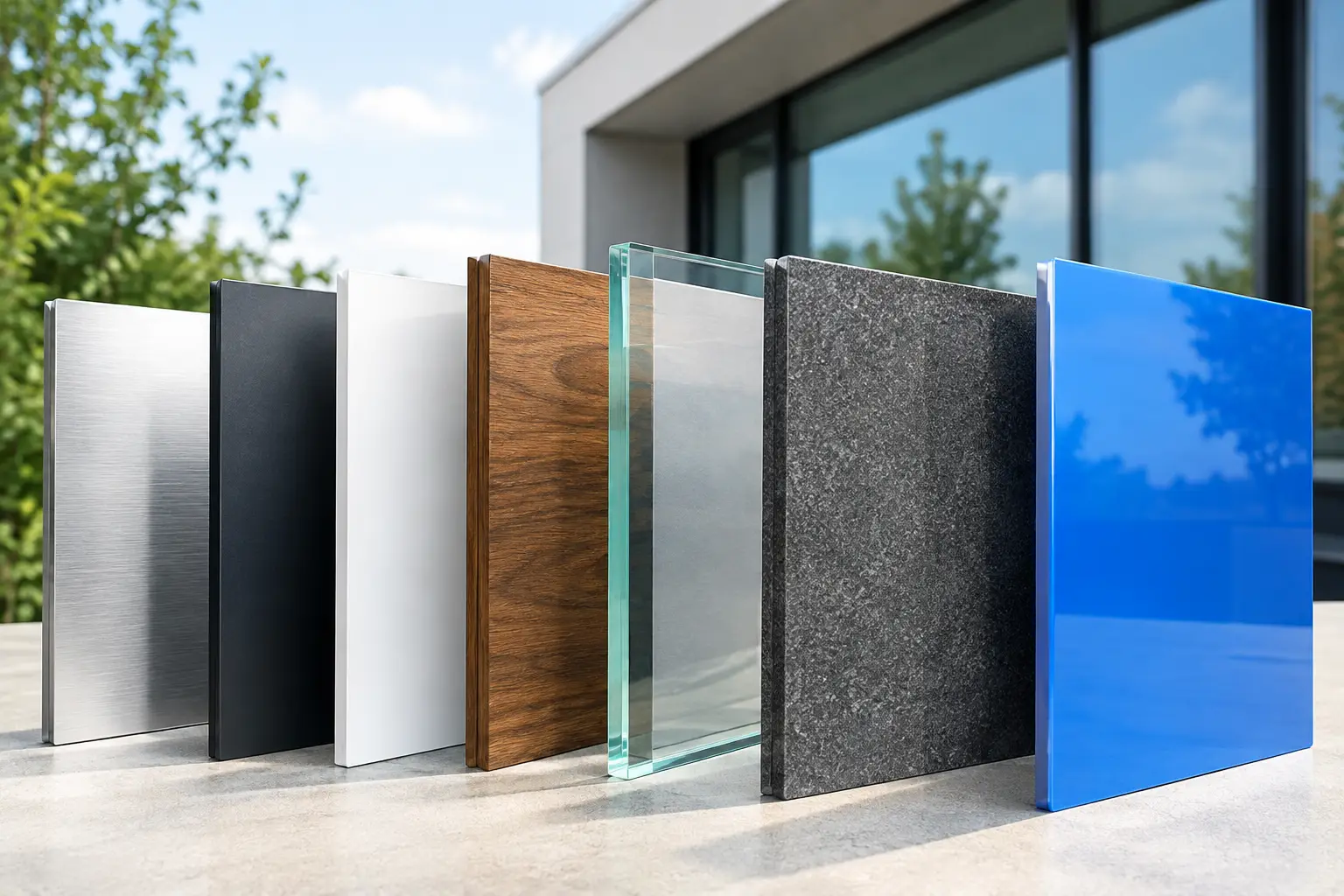
That does not mean every company needs neon green or a multicolor gradient. Color needs to support readability and work in practical applications. A palette that looks impressive on a screen may shift when printed on uncoated paper, appear muted in embroidery, or become expensive to reproduce across materials.
Start with a reliable core palette: one primary color, one or two supporting colors, and a strong black, white, or dark neutral option. Then make sure the logo also has approved one-color versions. This gives your business flexibility without sacrificing consistency.
Organic details and human-made texture
Perfectly polished design can sometimes feel distant. Organic shapes, subtle imperfect lines, and hand-drawn touches are showing up more often because they make brands feel personal and approachable. For local businesses, hospitality brands, specialty services, and companies built on relationships, that human quality can be a real advantage.
Still, this trend depends heavily on your market. A handcrafted visual style may be exactly right for a neighborhood restaurant or artisan service. It may be less effective for a commercial contractor pursuing institutional clients, where precision and scale are central to the promise. The logo should reflect how you want to be perceived, not simply what is trending.
How to Choose Logo Design Trends That Fit Your Business
Before approving a new logo direction, ask a basic question: Will this help customers recognize and trust us faster? A logo is not just a design asset. It is a practical business tool that appears at moments when customers are deciding whether to call, click, visit, or buy.
Start with your audience and competitive landscape. If every competitor uses blue, bold sans-serif type, and a generic icon, there may be room to differentiate. But differentiation should not create confusion. A healthcare provider should still look dependable. A legal or financial firm should still feel credible. A home service company should still look easy to contact and ready to work.
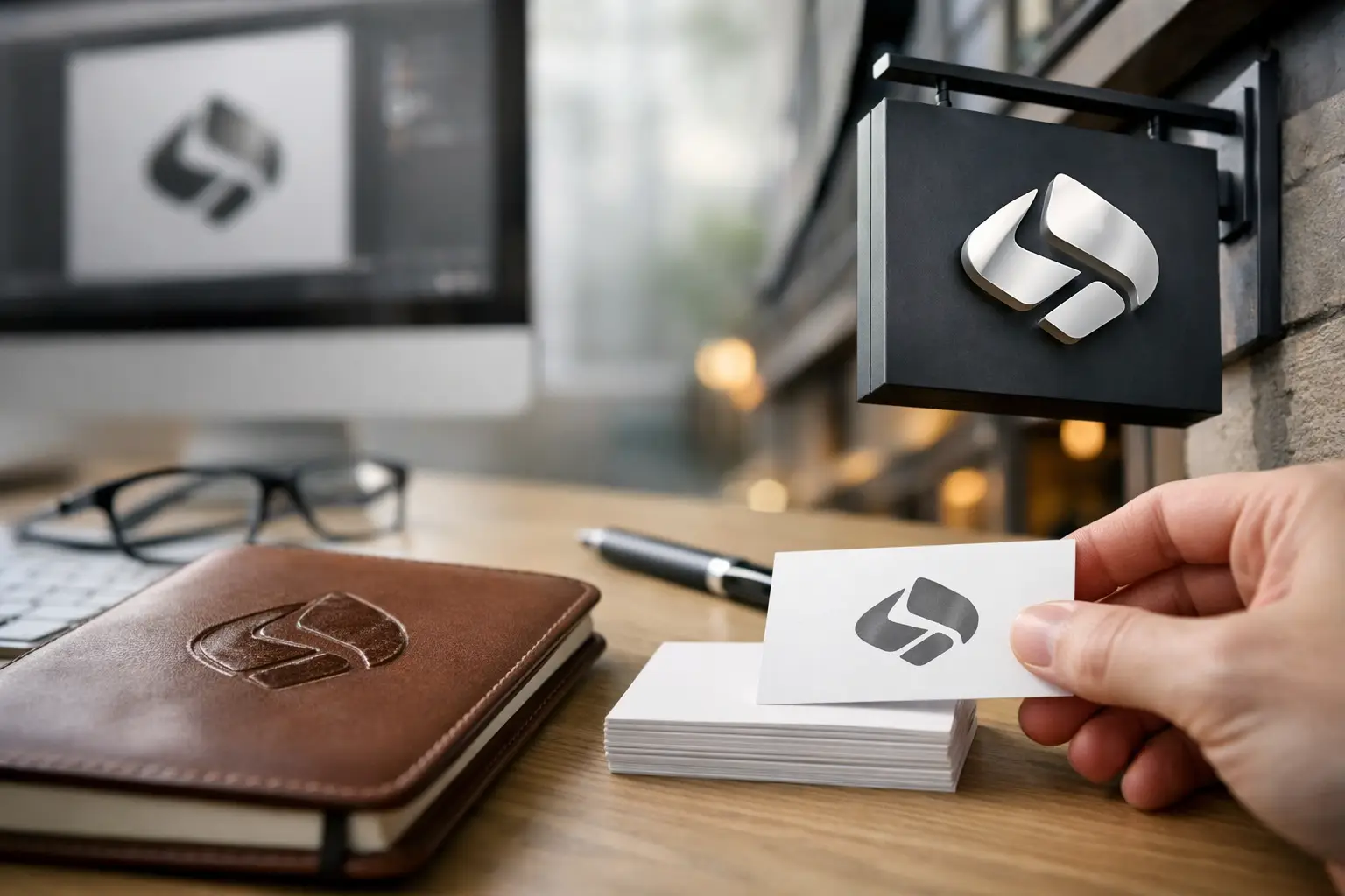
Next, consider the places your logo will actually live. A brand identity should be tested in realistic formats before it is finalized: business cards, a website header, a social profile, a yard sign, a vehicle decal, a shirt, a postcard, and a trade show display. This process often reveals issues that are invisible on a design presentation.
A thin line may disappear in embroidery. A light color may not have enough contrast on a sign. Fine details may fill in when printed small. These are not minor production concerns. They affect how professional your business appears in public.
Build a Brand System, Not Just a Logo
The most useful logo design trends support a larger visual system. Your logo should work alongside brand colors, fonts, photography, graphic elements, messaging, and layout rules. When those pieces are disconnected, every new flyer, landing page, sales sheet, or promotional item becomes a fresh design decision. That costs time, creates mistakes, and weakens recognition.
A clear brand system makes marketing easier. Your website can match your printed materials. Your trade show booth can look connected to your business cards. Your employee apparel can reinforce the same identity customers saw online. Consistency creates familiarity, and familiarity builds credibility.
This is also where working with one hands-on partner can reduce friction. At Echo Brand Geeks, logo decisions can be evaluated with the full picture in mind, from print specifications and signage to digital use and branded merchandise. That helps prevent a common problem: approving a logo that looks good in theory but becomes difficult or costly to use in the real world.
Avoid Trends That Create More Work Later
Some design choices age quickly because they depend on effects rather than a strong idea. Overly complex gradients, tiny details, novelty typefaces, and symbols that only make sense after an explanation can all limit a logo’s life span. They may also add production costs or force repeated redesigns across materials.
Be cautious with AI-generated logo concepts as well. They can be useful for sparking early ideas, but they often produce generic symbols, inconsistent lettering, and artwork that is not ready for professional reproduction. A business logo needs intentional design, clean files, clear usage rules, and a structure that can grow with the company.
A good test is to look at the logo in black and white, at a small size, and without the company name. If it loses all meaning or readability, it may need more refinement. The best marks are not always the loudest. They are the ones customers can recognize again and again.
Choose a logo direction that gives your business room to grow, not one that forces you to redesign every time you add a new service, location, or marketing channel. When your identity works consistently from the first handshake to the final invoice, your brand has a better chance to stay memorable for the right reasons.